The FUNKE brand manual and the path into the organisation
A new brand presence is more than a set of design parameters. It also has to arrive in everyday work and take root in people’s minds. Alongside the corporate design, further instruments were therefore created: a brand film, the FUNKE brand manual, further manuals, master templates and, eventually, the brand portal.
The FUNKE brand film
Introducing a new corporate design is not always easy for employees. CRENEO therefore devised and produced a brand film that vividly presents all the key substantive and formal brand parameters. This builds brand awareness and encourages people to act together in favour of a strong brand.
Communicating brand value – the FUNKE brand book
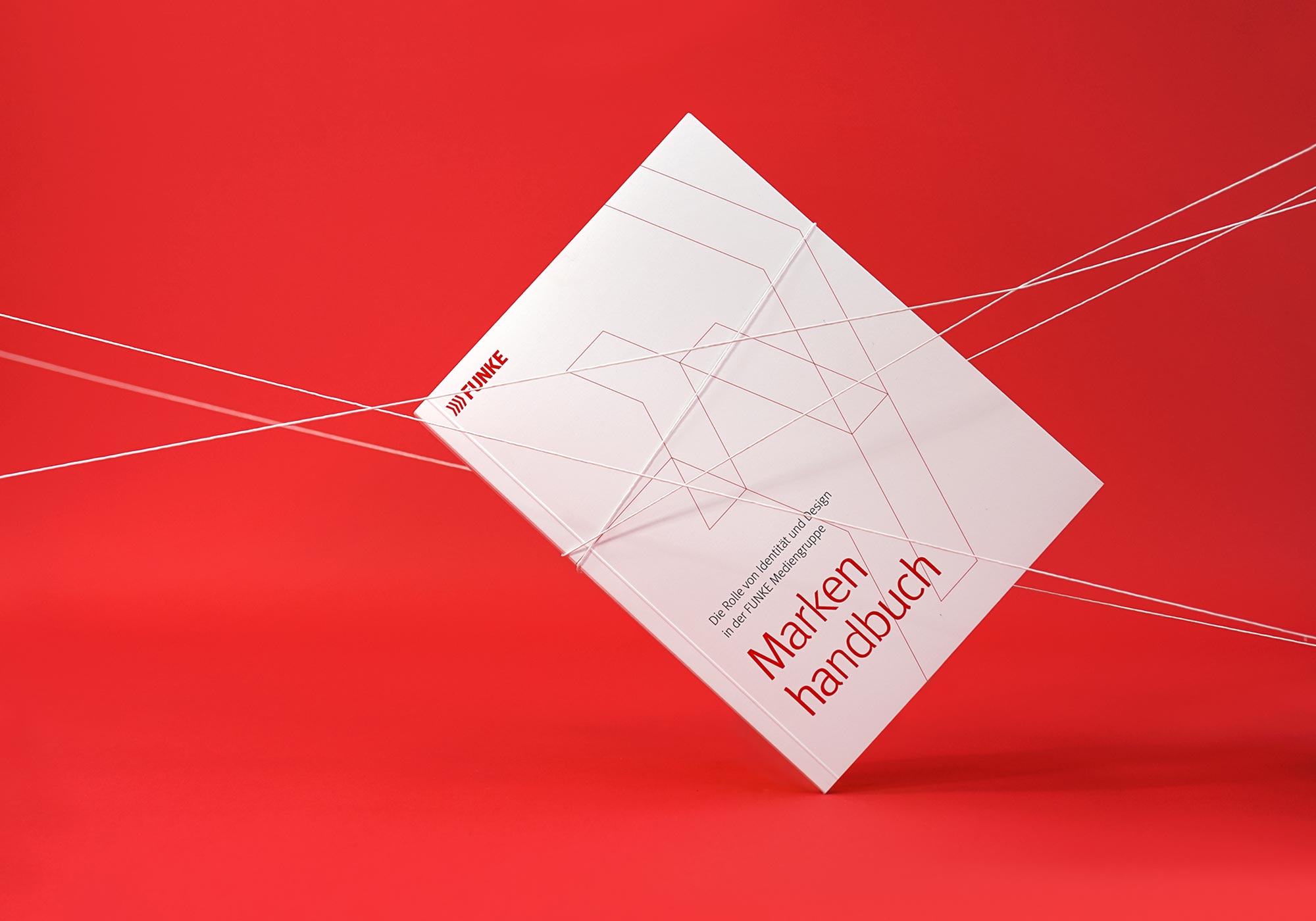
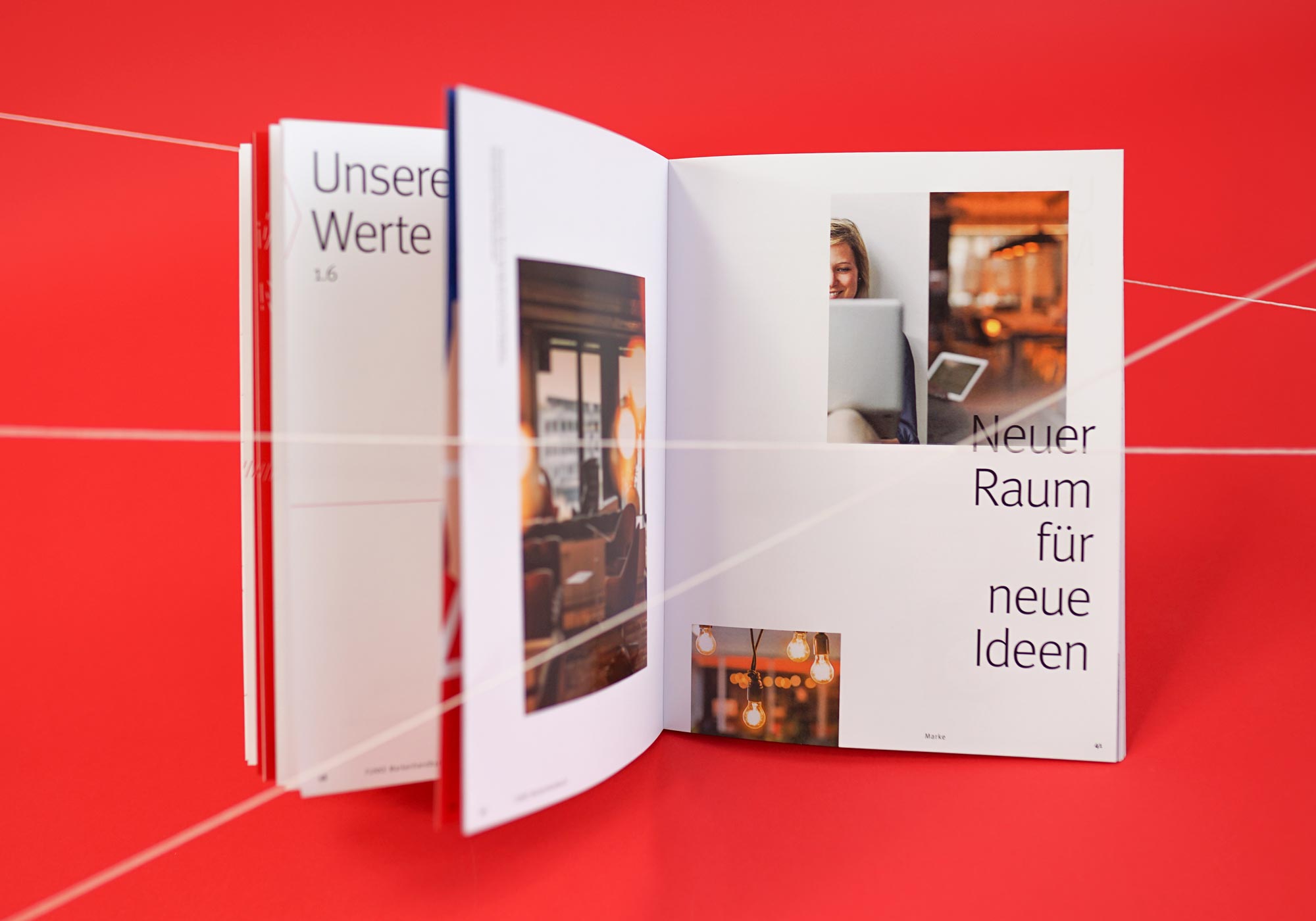
The FUNKE brand book answers the question that comes first: why a consistent brand language matters at all. Alongside formal aspects, it conveys how the company acts and how employees conduct themselves in internal and external communication.
The brand book comes with a clear poster on which all important design parameters are bundled.
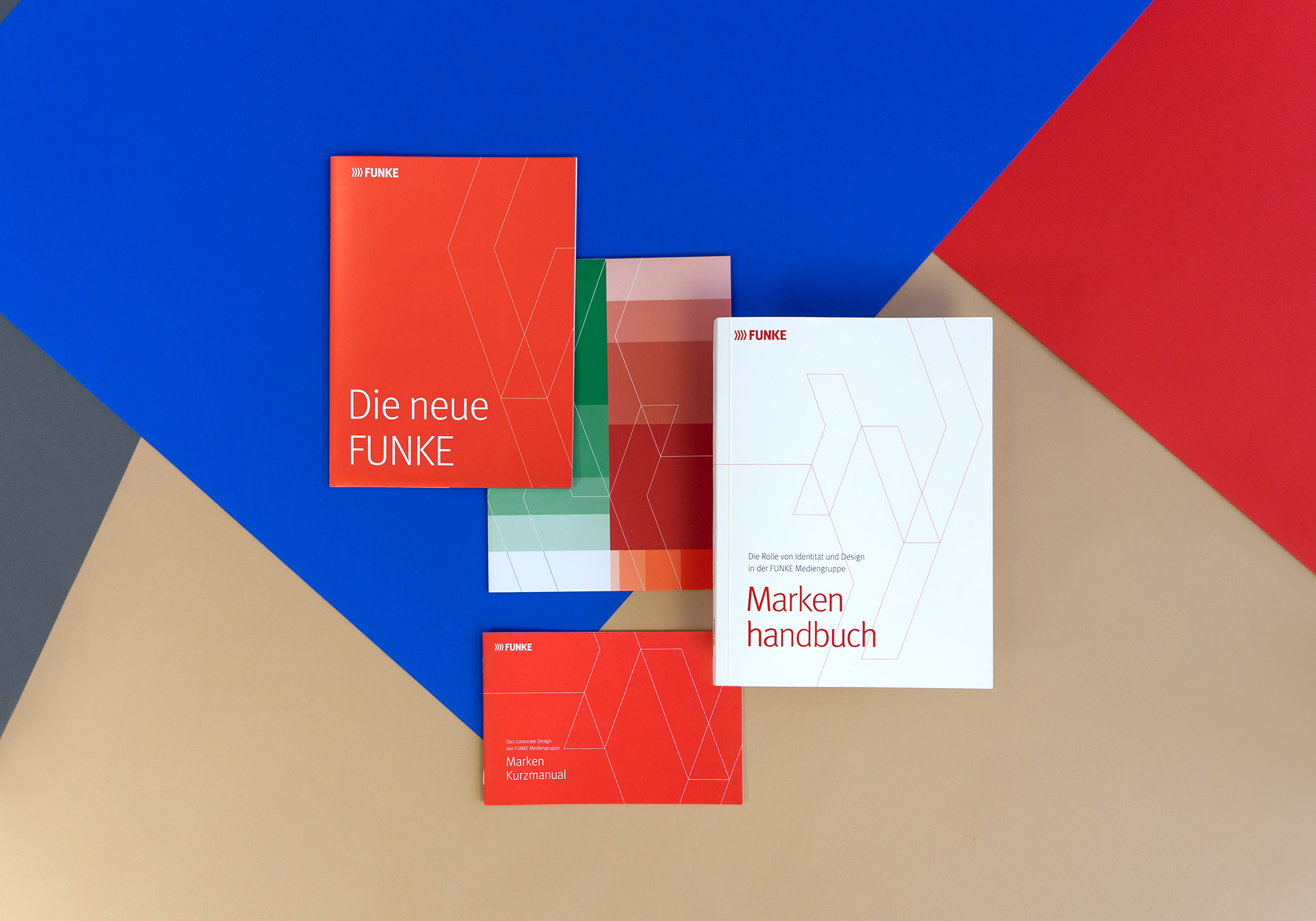
Three versions, three levels of depth
A condensed version was added for the rollout: the FUNKE brand short manual, in print and digital form. The same system is thus available in three resolutions — the corporate design manual for everyone who designs, answering questions of detail down to line weight. The brand book for everyone who communicates. The short manual for everyone.
This gradation is itself part of the system. A set of rules only takes effect when it reaches the people who are meant to apply it. Anyone setting a brochure needs the full manual. Anyone setting up an email signature needs two pages. The content is also available digitally through the brand portal — prepared for the specific question that arises in daily work, not as a document to read through. Anyone who wants to know something does not have to ask.
These rules are still maintained today. The current edition of the corporate design manual dates from 2025.
FUNKE master templates for everyday work
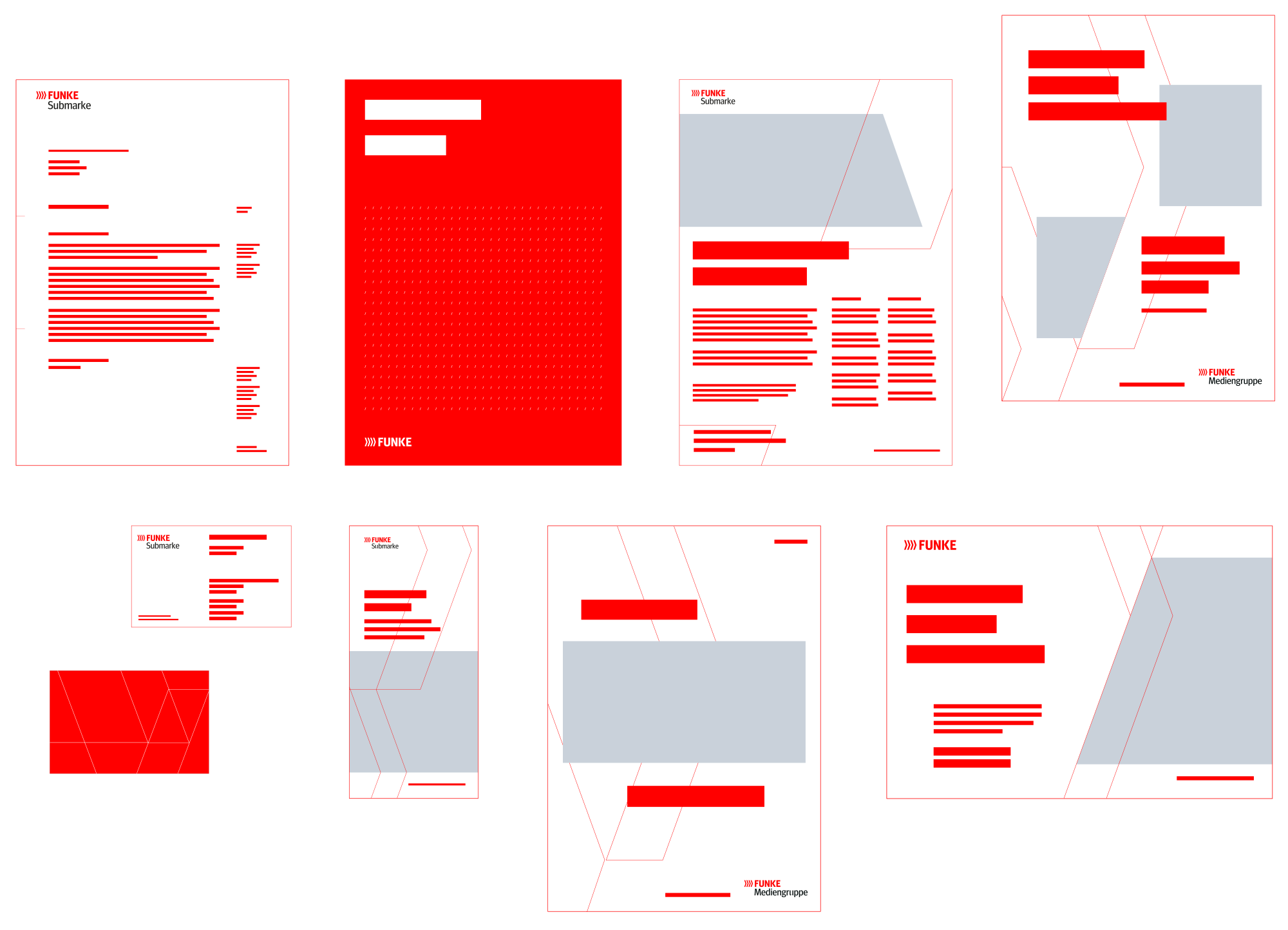
FUNKE master templates were created for a range of formats. Specifications such as column and line grids, paragraph and character styles as well as different layouts simplify the production of printed materials. Colour sets with an import function and extensive icon sets in all common file formats make application easier still.
How consistently this is thought through becomes clear in the file naming convention. Every logo file name follows the same sequence of date, parent brand, content, sub-brand, colour profile, colour mode, resolution and format. Anyone looking for a file can tell from the name whether it is the right one.
The FUNKE brand portal
To secure consistent use of the brand across all channels, CRENEO established the FUNKE brand portal: a central platform where all relevant brand elements are brought together. Communication managers and designers find templates, logos, imagery, typefaces and design guidelines there — always current and ready to use.
External service providers have access as well. Anyone who needs the corporate typeface requests it from the brand department, stating the intended use. This creates a defined route for a case that would otherwise become a matter of individual judgement.
Read more in the FUNKE brand portal case
What FUNKE has been able to do independently ever since
Teams and external service providers work from the same current state today, without having to check back with the brand department or the agency. Manuals, templates and the portal answer the questions that used to require a response. Consistency therefore emerges during creation, not only at approval.
How robust this is became apparent in 2025, when the FUNKEsans corporate typeface was introduced. Logos, templates, manuals and the portal followed the new typeface, without the system logic having to be rethought. The corporate identity carried the change, because it had been laid out as a system from the start.