The FUNKE corporate design — contemporary meets timeless
How do you give a media group with more than 30 sub-brands and over 590 product brands a single visual language? The FUNKE corporate design solves this through firmly defined design parameters rather than fixed layouts. As a result, the visual language of FUNKE Mediengruppe remains variable and still recognisable.
The new visual language of FUNKE Mediengruppe
The FUNKE brand film shows all the parameters of the new brand design shown below in a condensed and descriptive form.
Word and figurative mark
A logo that becomes a rule
Legibility and decodability at the smallest display sizes were the top priority during the revision. Based on the corporate typeface, the wordmark was reset and modified with subtle accents, the spacing within the symbol optimised and the relationship between the two elements redefined.
What matters for the system, however, is what hangs on the logo. The clear space equals the width of the letter F from the wordmark — a rule derived from the logo itself and therefore applying to every sub-brand as well. The minimum size is 2.5 millimetres. Alongside the primary red version, exactly four further display variants exist, plus nine don’ts. Nobody has to decide case by case whether an application is permissible.
New logo / previous logo
Colour
The FUNKE colour palette
The FUNKE colour palette consists of the primary colours FUNKE red, black and white, flanked by five newly developed secondary colours. Using the respective tonal gradations in addition creates a broadly varied palette overall.
Freedom ends where confusion could arise. In selected applications such as charts, the colours to be used are clearly defined. And advertisements for product brands follow the colour concept of the respective brand, while the group anchor secures affiliation.
Building block
The secondary brand element
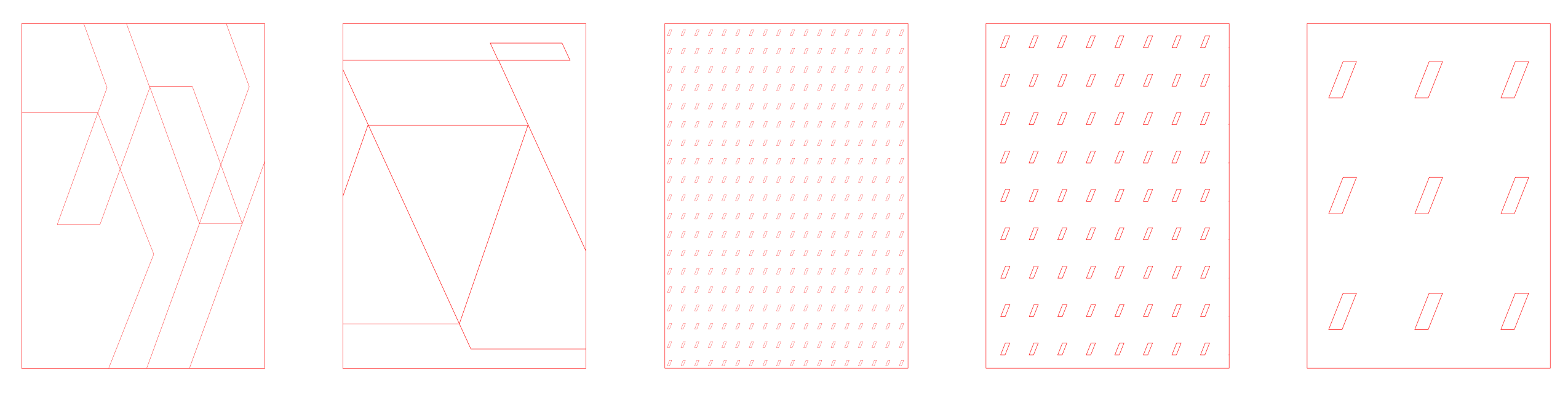
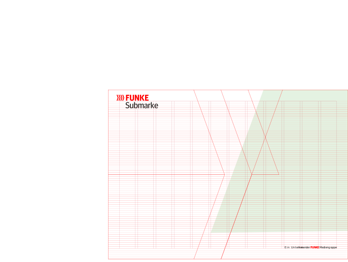
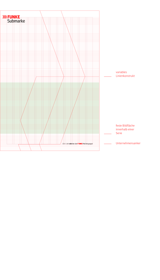
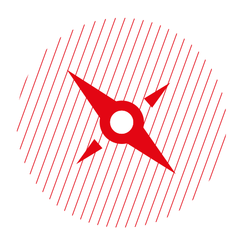
The secondary brand element derives from the symbol and works to structure and condense. From the isolated basic shape, a repertoire of forms emerges that is partly mirrored and reduced to outlines. The forms are placed so that they overlap, and the areas between them serve as carriers for colour fills, images and illustrations.
The element is bound to a few fixed parameters: 0.6 point line weight in common DIN formats, adjusted proportionally for large formats. The lines must always touch or intersect at at least one point. Within a series, the weight stays the same. From a single shape, this creates an element that looks different in every format and still remains recognisable.
Principle
One design principle instead of many templates
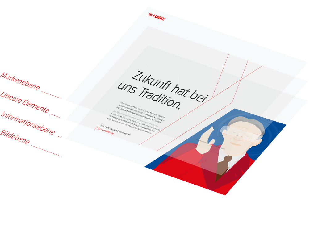
These building blocks are brought together through a group-wide design principle made up of firmly defined design parameters. Every layout is built in four levels: brand level, linear elements, information level and image level.
The difference from conventional templates lies in the logic. A parameter describes a decision, whereas a template covers only one case. Hundreds of applications can therefore be derived from the same parameters, without anyone having to decide anew.
Grid
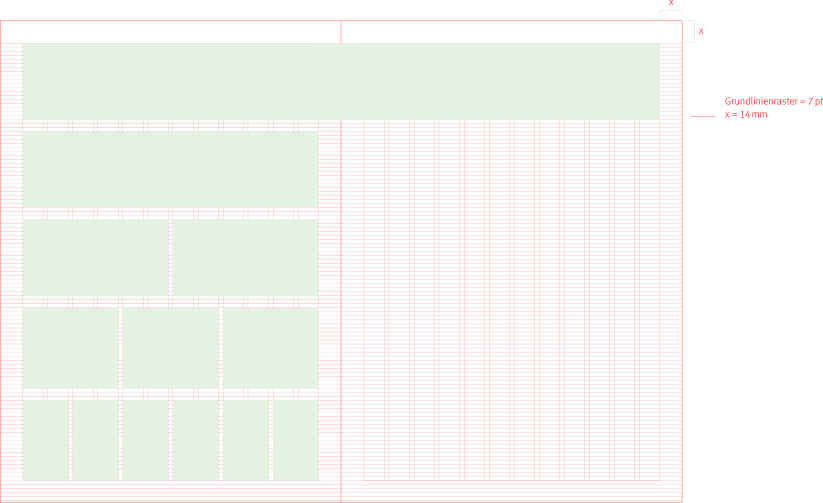
A flexible column grid for all applications
The layout system allows a maximum of individuality. Tension arises from shoulder heights, marginal columns, areas of calm and the arrangement of form, colour, image and typography.
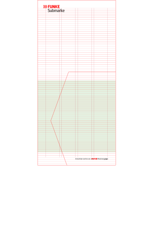
Beneath it lies a fixed framework: twelve columns for DIN A4, four for DIN long, plus a seven-point baseline grid that keeps the lines consistent within a series. Nobody has to decide on proportions case by case.
Typography
The FUNKE corporate typeface
The corporate design defines how typography is used. Four weights are used primarily, emphasis is created through varying weights and corporate design colours, and Arial serves as the correspondence typeface. Typesetting rules provide letter-spacing recommendations for each size range.
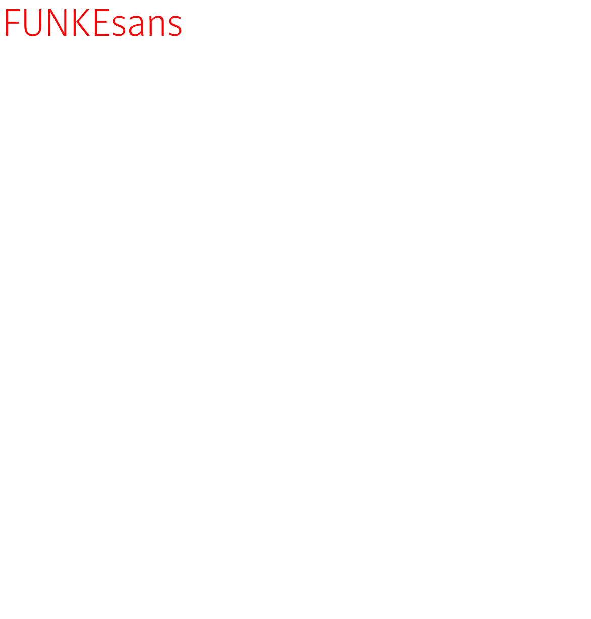
The recommendation to develop a proprietary corporate typeface dated back to the start of the project. Seven years later, FUNKE Mediengruppe introduced FUNKEsans — designed by the Berlin type foundry Just Another Foundry, accompanied by CRENEO throughout. It stands in the tradition of FF Meta and therefore on the same foundation as the previous typeface, complemented by FUNKEserif for print media. The existing typographic system could be carried over: individual values were readjusted, the logic behind them remained.
Imagery
Natural, engaging, documentary
The imagery conveys the identity and the ambition of the company. FUNKE imagery is characterised by a bright and friendly colour mood that supports and strengthens the company in its external presentation.
People are an important part of the photography, because they create closeness and trust. Photographic devices such as shallow depth of field, striking perspectives and interesting reflections make for an authentic and contemporary visual language.
The imagery is therefore part of the visual language of FUNKE Mediengruppe too — a parameter, not a collection. It describes what a motif has to measure up to, not which motif to choose.
Iconography
FUNKE Iconsset
Based on an iconography concept, an exclusive icon set was developed. Icons communicate visual content in simplified form and convey brand personality through shape and colour. Characteristic of the FUNKE iconography style is a simplified, linear construction with additional colour accents on individual elements.
Because the set exists as a closed library, teams select from it today instead of drawing anew.
Illustration
The FUNKE illustration style
Illustrations visualise and explain messages quickly and precisely. They convey complex content in an easily understandable way and are therefore more memorable.
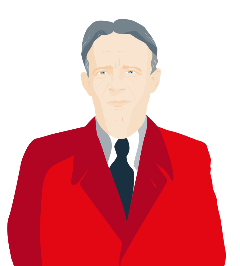
The FUNKE illustration style adds a further layer of communication. The illustrations are characterised by a colourful design with an emphasis on the brand colour red and by a minimalist approach. Two directions were developed for this: a flat one and a more restrained linear one, each offering different value depending on the medium.
In the design process, photorealistic material can be used as a basis. In this way, the two-dimensional illustrations develop a natural dynamic with simple means.
Information
Graphics and diagrams
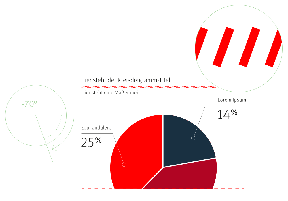
Promotional and factual charts, process diagrams and graphics can be used depending on the field of application and context. In combination with illustrations, a further layer of information can be added.
For charts, the colours to be used are clearly defined. Precisely where colour carries meaning, freedom of choice ends — otherwise the same colour would mean different things in two different charts.
The FUNKE corporate design does not prescribe layouts but parameters. From these, hundreds of applications emerge — each one independent, all of them recognisable.