Law Firm Corporate Design: gabor partners Stands Out, Rightly So
Law Firm Corporate Design: gabor partners Stands Out, Rightly So
The newly founded boutique law firm gabor partners wanted to stand out visibly from its competitors. In 2023, CRENEO therefore developed a law firm corporate design along with the corporate website. At the same time, the firm is the umbrella brand of the gabor partners brand family.
Brand Positioning Corporate Design Corporate Website Motion Design Social Media Strategy Ongoing Maintenance
2023
A new boutique law firm for Germany
Initial situation
gabor partners advises in three fields: inheritance law, corporate law and IT law. The new presence therefore had to show more than a firm name. The environment added to this: within the segment, presences resemble one another in colour and imagery. A new firm barely stands out among them. gabor partners consequently needed a visual identity that sets itself apart.
Objectives
The goal was a presence positioning gabor partners as an independent, distinctive and modern law firm. At the same time, it was to set the firm clearly apart from its competitors.
Strategy
As a first step, CRENEO analysed the direct competitors. This gave rise to the idea of a colour palette untypical for the segment. On this basis, CRENEO developed a striking brand image. A bold design system additionally ensures high recognition across all channels.
Design
Law Firm Corporate Design: A Colour Palette That Stands Out in the Segment
The visual identity relies on few, clear means. Violet and a vivid orange form a colour palette rarely seen in the law firm segment. All further elements derive from the brand mark, from the formal language through to the image shapes.
Construction of the figurative mark
The logo consists of a figurative and a word mark. The figurative mark is a simplified representation of the letters “g” and “p”. Gleichzeitig fungiert die Bildmarke auch als Vehikel, um unterschiedlichste Leistungen der Kanzlei zu kommunizieren.
Picture-word mark
The choice of a thin typeface creates an interesting interplay between colour, white space and the power of typography.
# FFFFFF
# 532270
# FF4200
Language of form
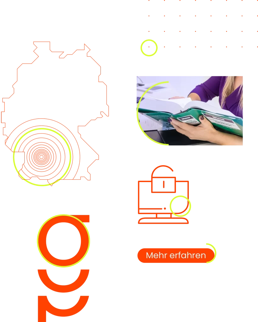
The shape of further design parameters is derived from the figurative mark. It is found again in grids, icons, surfaces and image forms. The design language is used in an accentuated way.
Animations
The animated 3D logo conveys a wide variety of messages from the 3 specialist areas. It increases the attention of the interest groups within the website and provides additional visual variety.
Animations
The animated 3D logo conveys a wide variety of messages from the 3 specialist areas. It increases the attention of the interest groups within the website and provides additional visual variety.
Imagery
The image world also follows the firm’s colour code consistently. Ample space, a clear focus on the protagonists and a subtle tinting of light surfaces create a coherent image concept.
Business equipment
The central approach of the concept is fact-based storytelling. Current statistics on inheritance and wills underline the relevance of the topic for the exclusive target groups.
Motion picture
Moving image with impressions from the firm is added as a further stylistic device. This creates greater closeness for prospective clients and at the same time more life within the web presence. CRENEO deliberately opts for monochrome footage so that the movement does not distract from key messages.
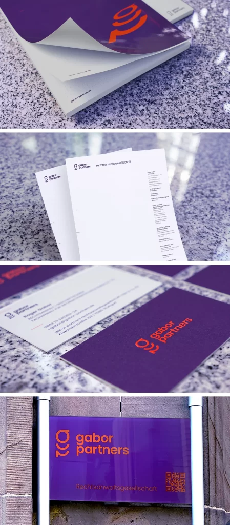
Business equipment
Implementation
The Corporate Website: Colour, Movement and Clear Paths
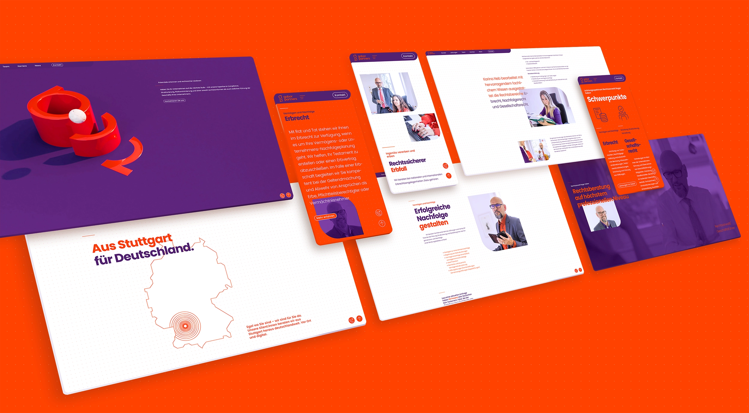
On the gabor partners corporate website, the visual identity becomes tangible. Colour changes between viewports structure the page. Varying font weights and sizes steer attention at the same time. Micro-animations keep the presence lively. The animated 3D brand mark additionally increases visitors’ attention. The navigation follows the firm’s own logic as well. „Leistungen“ holds the fields of law, „Team“ the lawyers. The news section is sorted by field of law too. Each target group therefore quickly finds the right point of entry. CRENEO used images and videos in a deliberately balanced way, since the website was also to remain performant.
The navigation follows the firm’s own logic as well. „Leistungen“ holds the fields of law, „Team“ the lawyers. The news section is sorted by field of law too. Each target group therefore quickly finds the right point of entry. CRENEO used images and videos in a deliberately balanced way, since the website was also to remain performant.
Social media
The Corporate Design in Day-to-Day Operations
For gabor partners, CRENEO developed a social media strategy for Instagram and LinkedIn. Fixed formats give the posts a recognisable frame. These include a quiz, checklists, a case of the week and the series „Willkommen im Team“. Each post also carries its field of law as a label, such as inheritance law or corporate law. The channels thus follow the same structure as the website.
Visually, the posts pick up the corporate design directly. The pairing of violet and orange determines the surfaces, joined by the grid and formal language from the brand mark. The photography follows the firm’s image world as well. The brand therefore remains recognisable beyond its own website. The firm supplies the expertise, while CRENEO handles design and publication.
Result
A Law Firm That Stands Out and Can Grow
GABOR Rechtsanwalt has become a boutique law firm with a presence of its own. The untypical colour palette makes the firm distinguishable within a conservative segment. The brand mark conveys all three fields of expertise rather than merely showing the name. The firm can therefore add new topics within the existing system. For the corporate design and the corporate website, CRENEO received the Deutscher Agenturpreis twice in 2023.