Concise brand redesign for the architecture firm GeiselhartMusch
Initial situation
GeiselhartMusch is an architectural office from Düsseldorf that convinces with modern and factual, but also classic and elegant work.
The holistic approach is the focus here. Architecture and interior design form an appealing unity. In the course of a brand redesign, rheinvisuell was commissioned to revise the corporate design and develop a new website.
Reduction
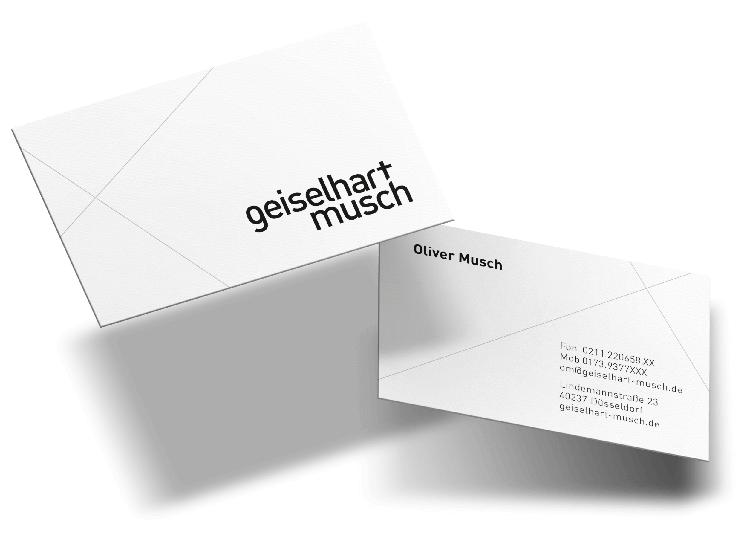
The old logo contained a “& ” sign. During a brand workshop, it became clear that the owners of the architecture firm as well as their clients only used the GeiselhartMusch pronunciation in everyday life. This was the basis for the new logo. The two-line structure creates more compactness and conciseness.
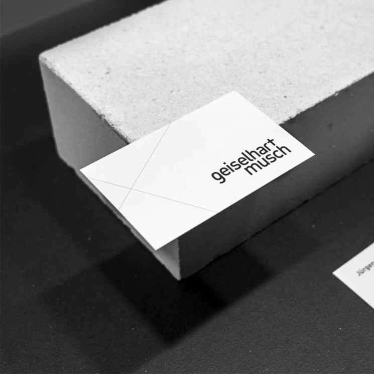
Defining spaces – the secondary brand element.
The secondary brand element is derived from physical spaces. Spatial reference axes are ported into the two-dimensional and function here as structuring elements within the visible design surfaces.
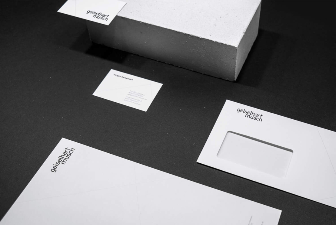
Business equipment and stationary
The business stationery impresses with clarity and reduction. The use of the secondary brand element creates structure and condenses the visible surfaces.
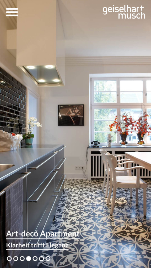
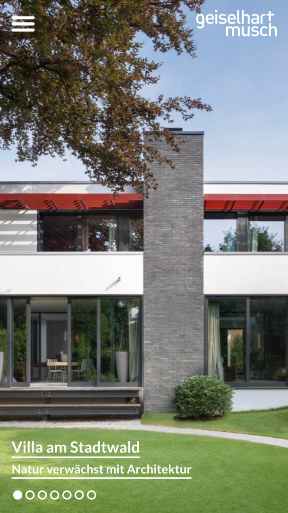
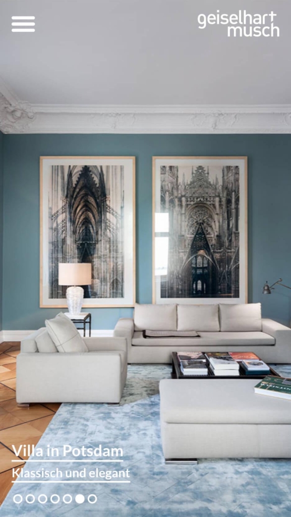
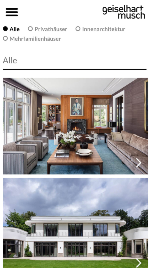
Concept and realisation of the website
In the course of the project, a new responsive website was created. The aim was to give the architects’ work the greatest possible space.
Thematic clustering in the frontend and later easy maintenance by the client in the backend were further components of the order. The result is a minimalist, functional and timeless website.
„
Phonetics can have an impact on the development of a brand design. GeiselhartMusch is a prime example of how changing language habits influence an existing brand.
Alexander Willuweit Managing Director / Creative Director, CRENEO
Many of our projects start with a concrete situation — not with a finished brief. If what you’ve seen here resonates with you, let’s have a short conversation.
Alexander Willuweit takes 30 minutes to understand where you stand — and whether we are the right partner for your next step. No pitch. No pressure.