CRENEO developed an eye-catching brand design for the client that is unusual for the segment and conveys the combination of innovative, holistic equestrian training and health concepts in a modern and individual way.
The first part of the project was the development of the company name including a review of the rights of use in German-speaking countries. Furthermore, the recommendation of an adequate tonality, the development of a word-picture mark and a corresponding graphic concept.
Within the colour world, strong colours form an exciting contrast to the muted tones. Derived from the anatomy of humans and horses, simplified bones form the basis for the secondary brand elements. These are used animatedly or statically, create a condensation of design spaces within the communication channels and provide visual tension.
Muli
Merriweather
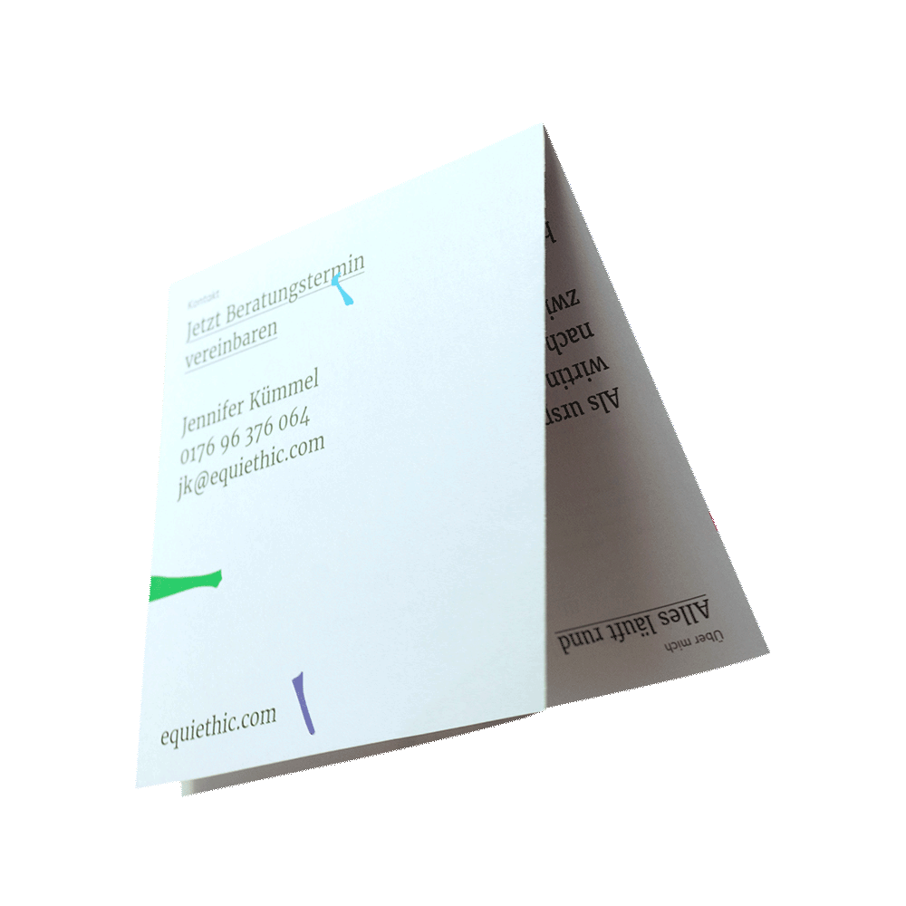
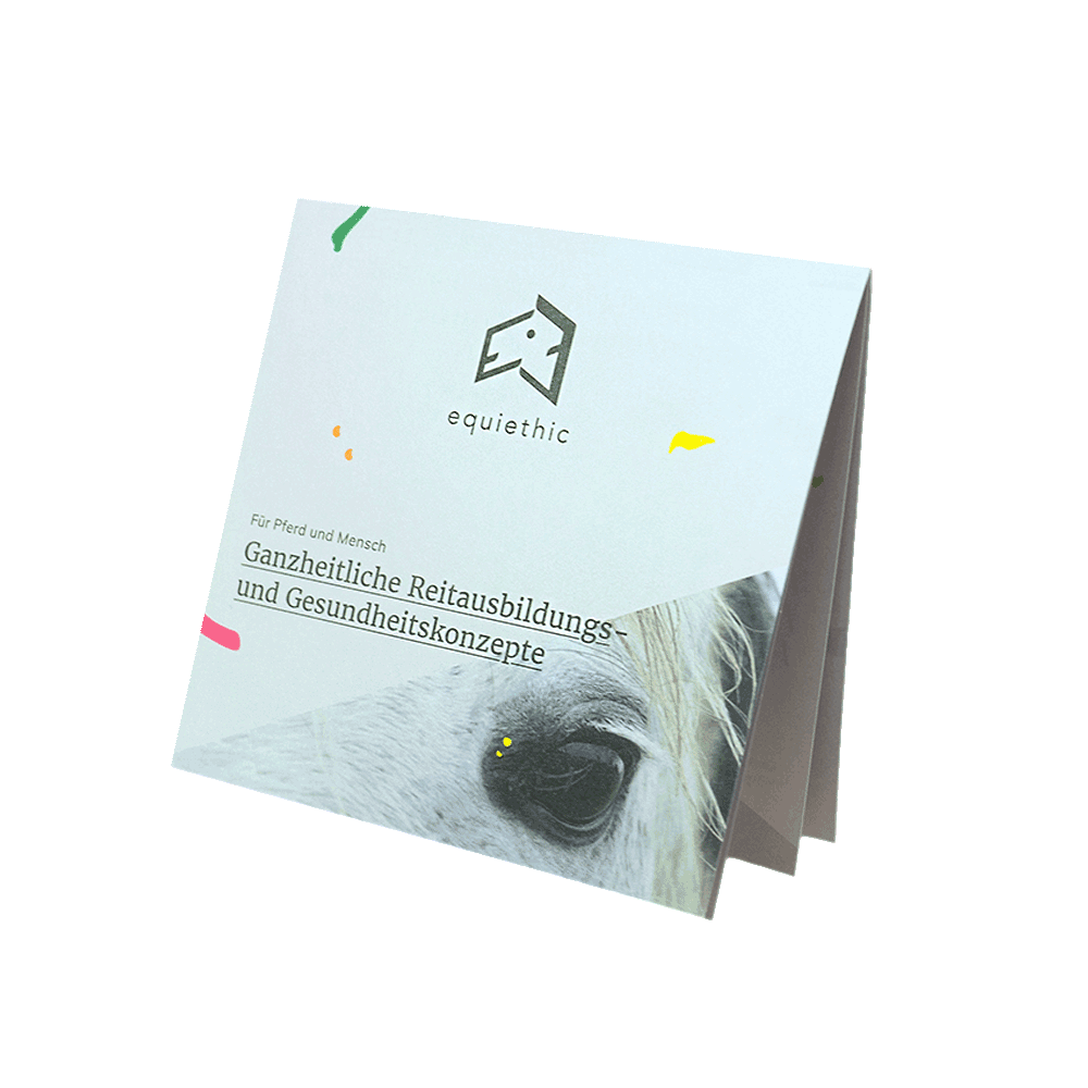
Within the business stationery and advertising materials, the definition of airy design spaces is an important brand feature. Cheerful colours, an abstract language of forms and the special handling of typography are further characteristic brand design parameters. Business cards with a colour cut and an uncoated paper for a pleasant and natural feel, round off the brand presence.
Colour world
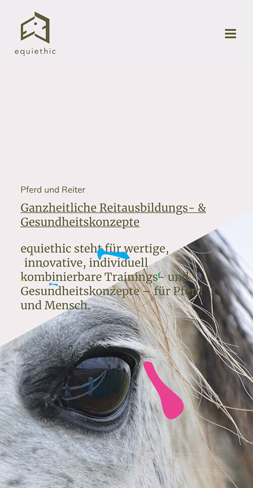
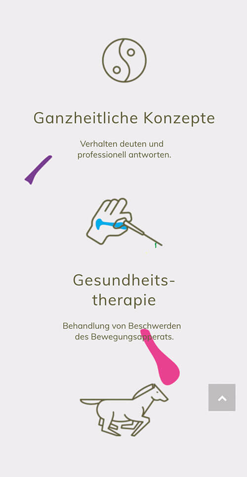
A website – designed as a one-pager – was built with an individualised, user-friendly and easy-to-maintain CMS. A clear menu with navigation jump-marks remains permanently visible. Call-to-action buttons, distributed over the entire website, encourage people to get in touch.
CRENEO