The VdS corporate design: one system for many applications
The VdS corporate design translates the brand architecture into visual form. To that end, CRENEO developed a modular VdS design system built from fixed design parameters and variable components. This creates recognisability without making every application look the same.
Principle
Consistent without becoming monotonous
VdS communicates across many business areas, topics and formats. The corporate design therefore had to meet two requirements at once: establish a clear sender and still leave enough room for different content.
The answer is a layered principle. Logo, colour, typography and recurring design elements form the fixed frame. Within that frame, layout, image and content can vary. VdS stays recognisable across different media without depending on rigid templates.
Visual language
A few parameters create recognisability
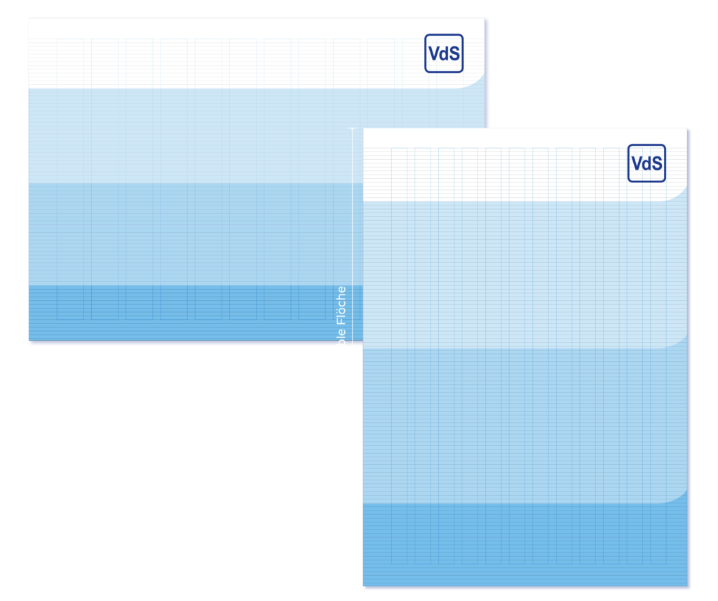
VdS blue is the visual constant of the appearance. It is complemented by a visual language that brings different motifs together through a shared colour range. Linear image extensions pick up this logic and join photography and surface into a recurring visual language.
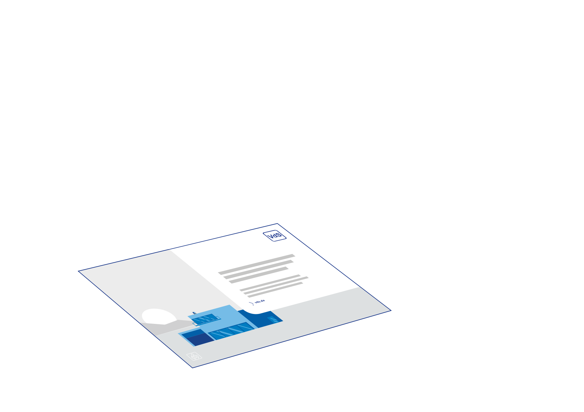
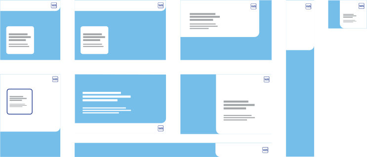
It all starts with the logo itself. The VdS logo now always sits on its own panel with a rounded corner, echoing the shape of the combination mark. This panel is white or light, either as a monochrome tint of 10 to 15 per cent or as a light image. Because its width is variable, a further name can appear to the right of it.
Recognisability therefore comes not from identical layouts, but from recurring principles.
Colour palette and imagery
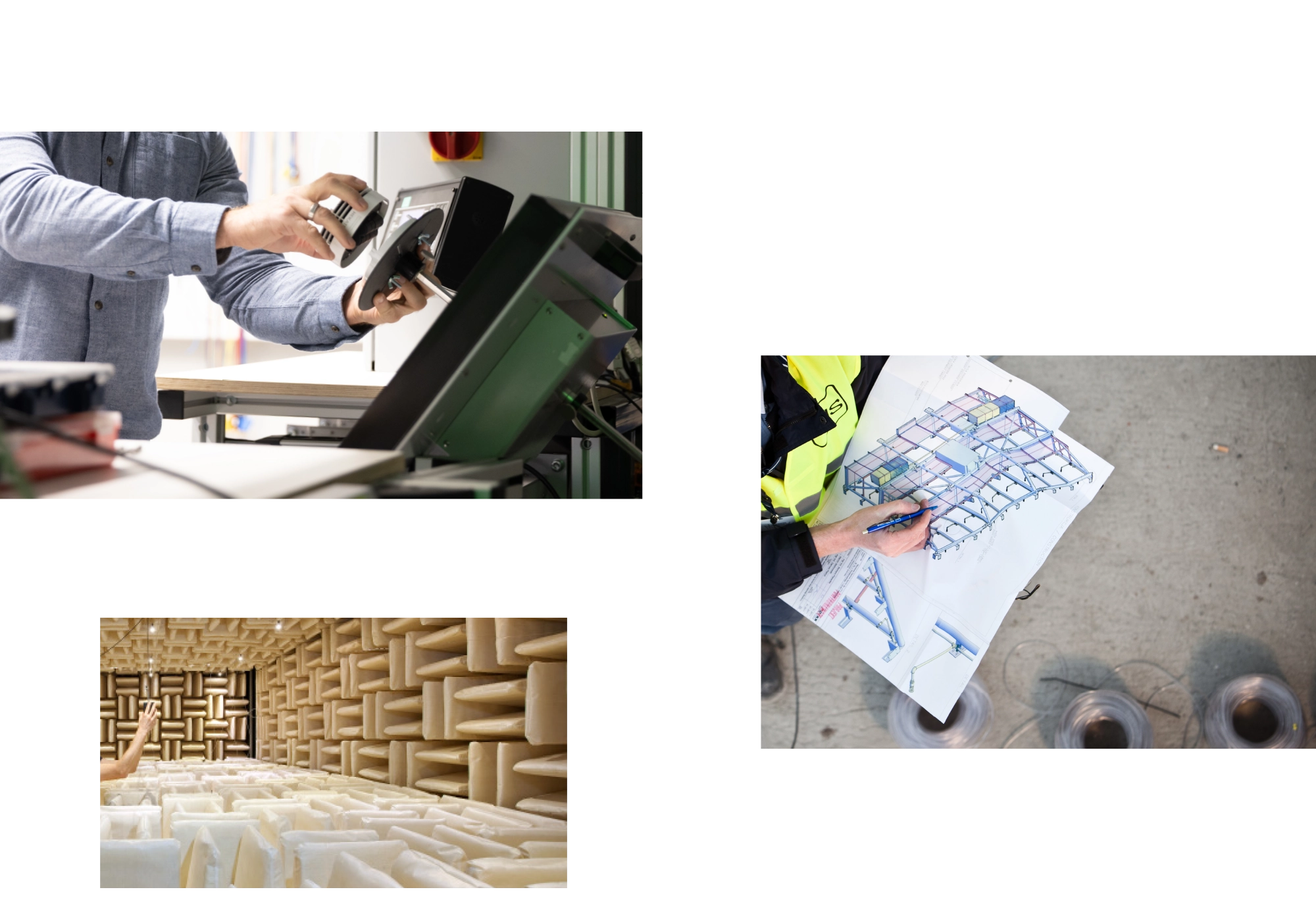
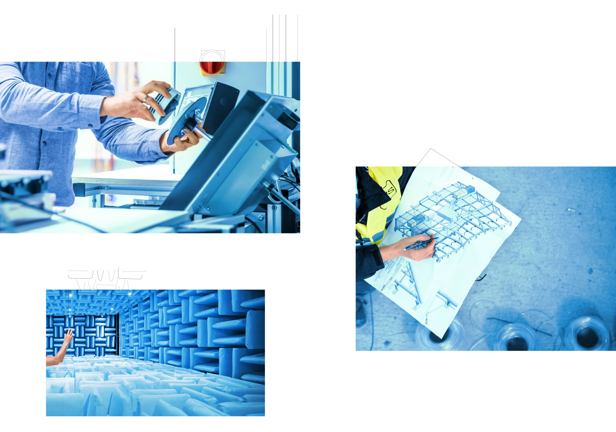
A dedicated secondary palette emerged from VdS blue. Its gradations stay close to the brand and still keep their brilliance. The same palette colours the imagery: photographs are held together by a blue tone and thereby move into the system, regardless of where they come from.
#003e90 RGB | 0 62 144 CMYK | 100 85 0 0
#005faa RGB | 0 95 170 CMYK | 95 60 0 0
#007ec3 RGB | 0 126 195 CMYK | 85 40 0 0
#2699d6 RGB | 38 153 214 CMYK | 75 25 0 0
#51aee2 RGB | 81 174 226 CMYK | 65 15 0 0
#76beea RGB | 118 190 234 CMYK | 55 10 0 0
#373a3b RGB | 55 58 59 CMYK | 10 0 0 90
#6c6e6f RGB | 108 110 111 CMYK | 5 0 0 70
#8d9091 RGB | 141 144 145 CMYK | 5 0 0 55
#a1a5a7 RGB | 161 165 167 CMYK | 5 0 0 45
#c6c6c6 RGB | 198 198 198 CMYK | 0 0 0 30
#e0e2e3 RGB | 224 226 227 CMYK | 2 0 0 7
#f0f1f2 RGB | 240 241 242 CMYK | 1 0 0 7
Building blocks
Complex content gains a shared language
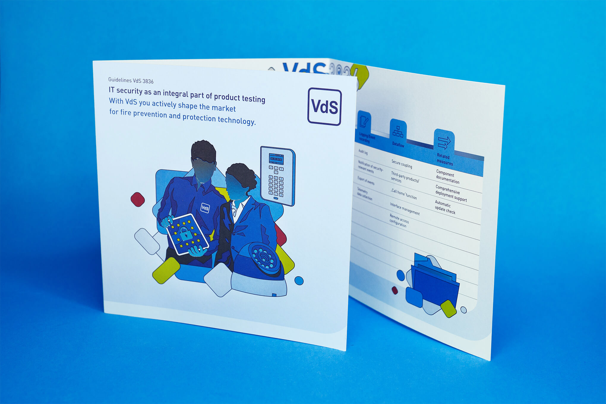
Corporate security covers many topics, services and technical details. For this, CRENEO developed a dedicated iconography as well as illustrations, infographics and diagrams.
The icon set distinguishes between the overarching business areas and the services within them. Reduced variants exist for smaller sizes. The system therefore remains legible even where space is limited.
Individual design elements thus become a toolkit that structures and conveys even complex content consistently.
Iconography
Applications
A VdS corporate design for every format
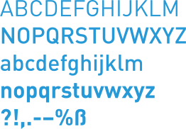
Whether brochure, advertisement, certificate, moving image or spatial design: the VdS design system has to carry very different formats. Portrait, landscape, square and special formats therefore draw on the same principles instead of inventing a new design for each application.
This is precisely where the strength of the system shows. Applications can look different and still belong unmistakably to VdS.
The rules for this are not only designed, but documented and prepared for further use. How VdS works with them independently is shown in the rollout.
Spatial applications
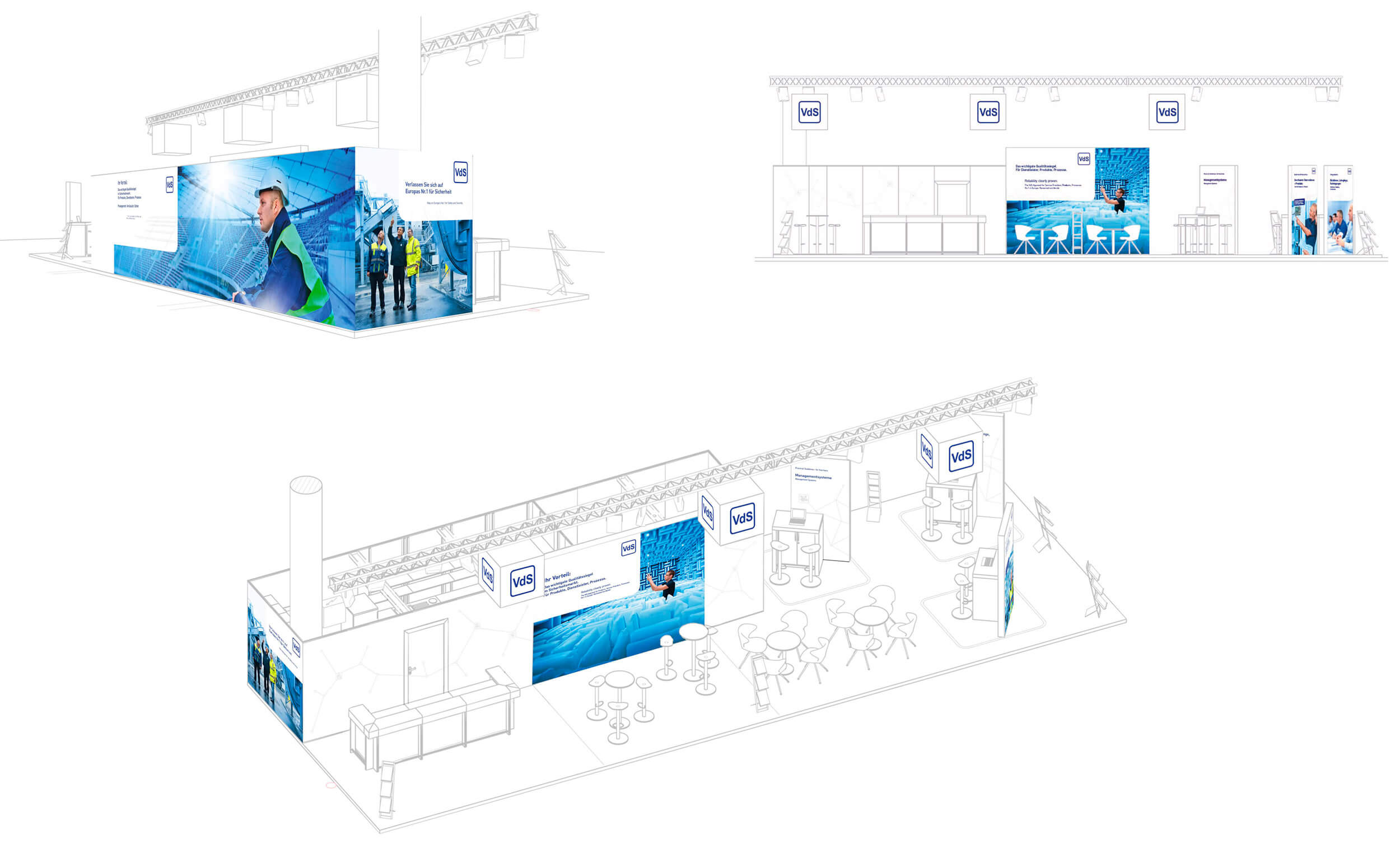
VdS also remains clearly recognisable in three-dimensional space. For national and international trade fairs, the design system was transferred to exhibition stands and digital LED surfaces, making it tangible on site.
Certificates
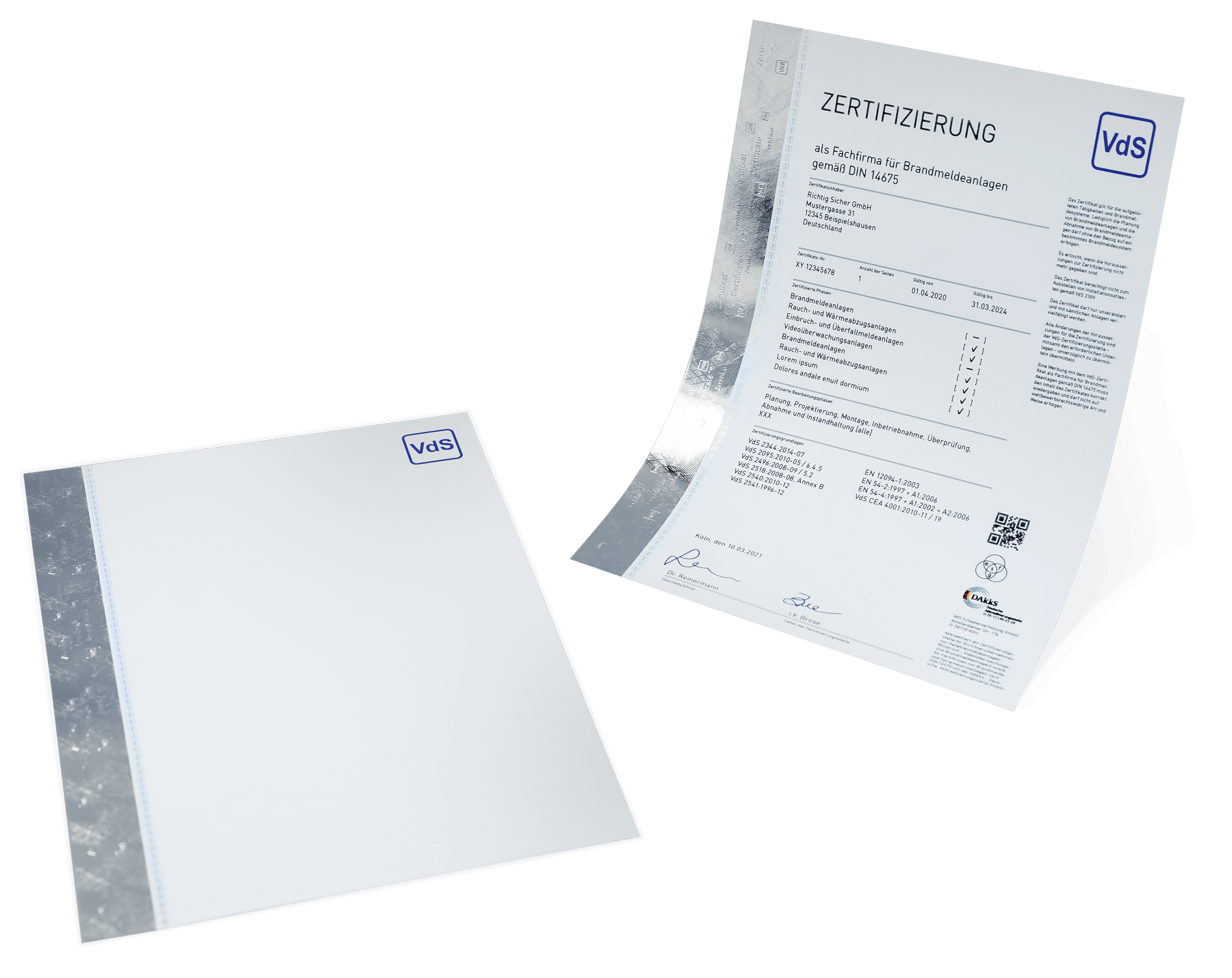
VdS certificates follow the design system too. Different content and languages are clearly structured, while blind embossing, foils, holograms and special colours provide a high-quality look and feel.
Moving image
VdS stays clearly recognisable in motion as well. Logo animation, sound logo and film campaigns carry the VdS design system into moving image and create a consistent presence beyond static media.
IOT-Film
Cyber-Security-Film
One system for an entire communications mix
For the cyber-security field, a dedicated communications mix emerged from the existing VdS design system. Brochure, social media, product film and trade fair presence all pick up the same visual language. The new topic gains a presence of its own and still remains unmistakably VdS.
The VdS corporate design creates unity without limiting variety. Clear design parameters and reusable components ensure that topics, formats and media belong recognisably to VdS. The result is a VdS design system that also carries new tasks.