For AWO WohnBau, CRENEO developed the AWO WohnBau Corporate Website – independent in design and tone, built on the existing network platform as the third unit on the same REDAXO basis as the parent brand and Migration Service.
Customer
Employees
Website Launch
AWO WohnBau
19
2025
0
Workshop
0
Subpages
0
Documented Projects
Starting Point for Future-Oriented Brand Communication
Initial situation
AWO WohnBau GmbH has been responsible for construction and maintenance projects for AWO Mittelrhein since 2016 – from senior housing to care facilities and new kindergarten buildings. As an independent company within the network, a digital presence was missing that would make these services visible and address the different target groups in a targeted way. For the digital realignment, a half-day workshop was conducted together with CRENEO – as the foundation for the structure, design and content of the new website.
Objectives
The goal was a digital presence that positions AWO WohnBau as an independent brand within the AWO network – clearly structured, visually distinctive and seamlessly integrated into the shared platform.
Present senior housing locations and building projects clearly
Address prospective tenants and partners from the housing sector in a targeted way
Develop an independent visual identity within the AWO brand family
Ensure seamless integration into the existing REDAXO network platform
Colour Palette – Familiar Colours. New Accent.
AWO Red is retained as the central identifying element – in line with the Corporate Design of the AWO. To create a modern and consistent external appearance, the colour palette of AWO WohnBau was extended with calm grey tones and the accent colour “AWO Blue”. AWO Blue is used selectively for buttons and links to enhance user-friendliness. The result is a clear, professional look that makes the connection to AWO Mittelrhein visible while at the same time enabling an independent digital presence.
Formal Language – Architecture Becomes Design.
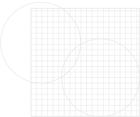
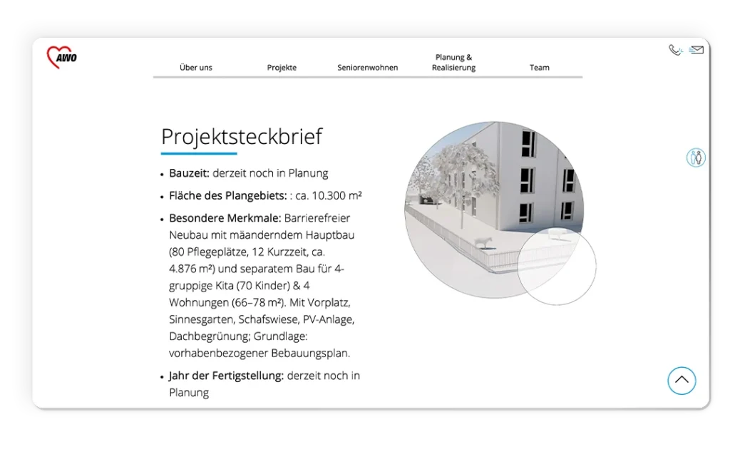
For the AWO WohnBau Corporate Website, geometric forms were derived from an architectural plan. They create orientation, reflect the working environment in design terms and strengthen the visual independence
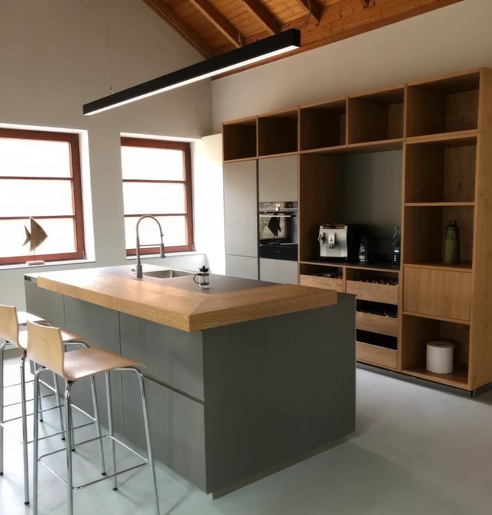
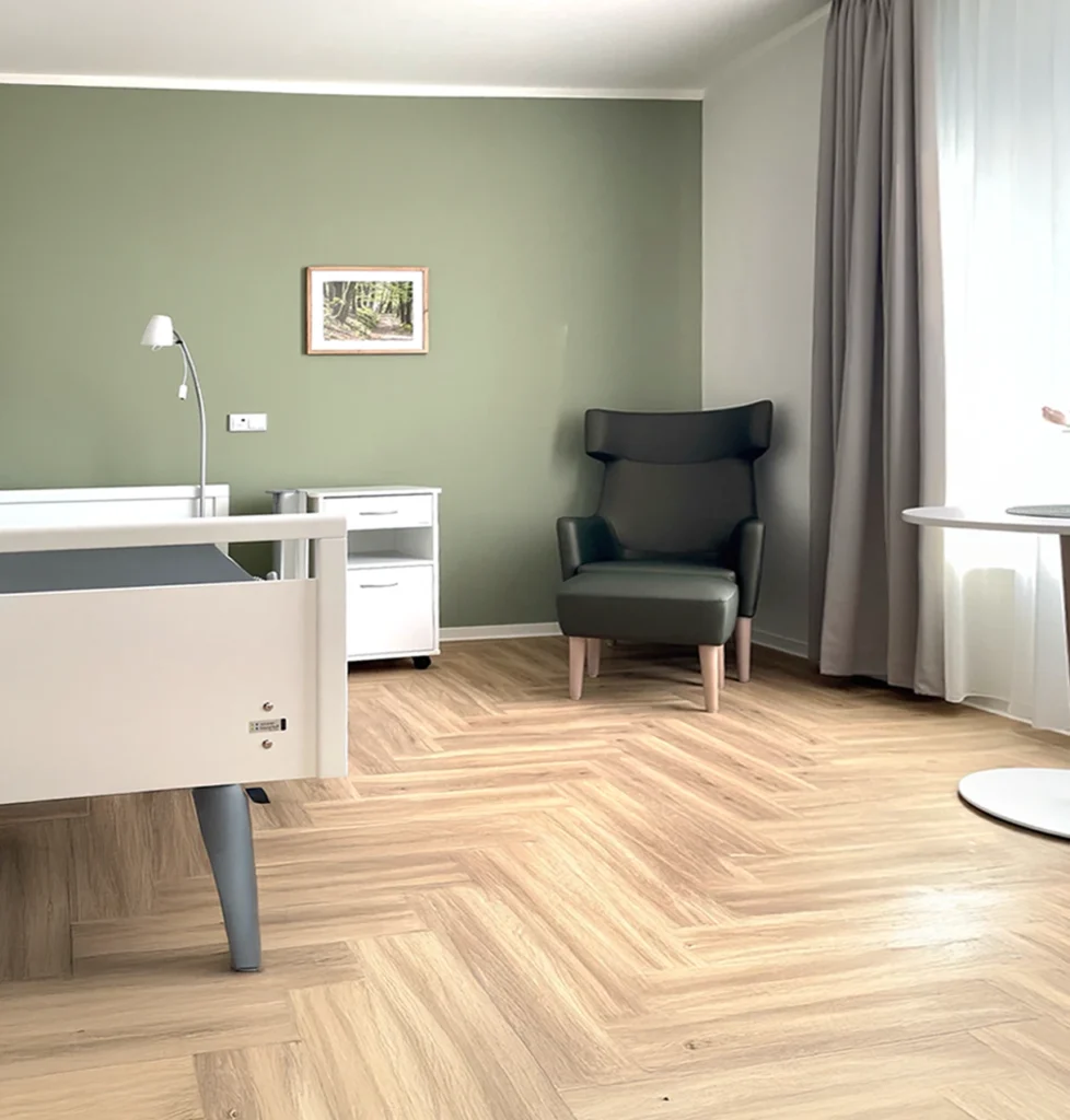
AWO WohnBau Imagery
Reduction with Depth – the New Visual Language.
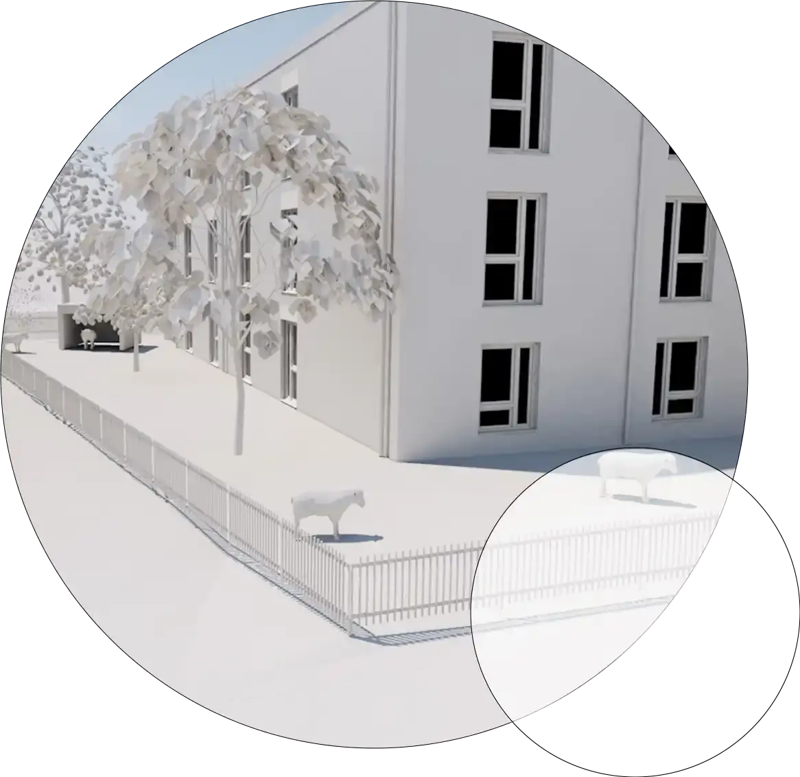
Images were used in a targeted way to support clarity and structure. Geometric forms complement them as frames, fill surfaces or overlays. Images are partially set within circles or squares – for a distinctive and consistent look.
Photo credits: HWR Architekten
Einheit in Form und Bild – Gestaltung mit System
The website is built on a considered visual language in which forms are not merely decorative but have been functionally integrated. As a connecting element, they interplay in image design, animation and illustration, lending the website structural depth. This conceptual consistency makes the presence not only consistent, but also independent within the AWO Mittelrhein cosmos.
Animation and Illustration
Form trifft Funktion
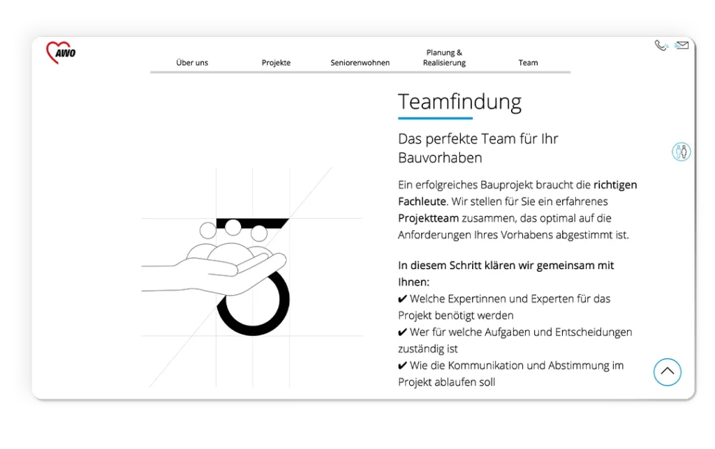
Animations make project processes tangible and vivid. Numbers and content are clearly structured through geometric forms. The illustrations also follow the existing formal language – and integrate seamlessly into the visual concept.
Implementation
The AWO WohnBau Corporate Website as a Considered Web Experience
The AWO WohnBau Corporate Website impresses with a clear structure and an uncluttered user experience. The geometric formal language is used consistently – as an image element, but also as a subtle background graphic. White space and blue tones complement the design and create a calm, cohesive overall picture.
Result
Independent in Presence. Integrated in the System.
With the AWO WohnBau Corporate Website, a digital presence was created that makes ten senior housing locations and six building projects clearly and accessibly structured – for prospective tenants, residents and partners alike. The architecture-inspired formal language creates an independent visual identity that at the same time integrates seamlessly into the AWO Mittelrhein cosmos: recognisable as part of the network, distinctive as its own brand. Technically, the website runs on the same REDAXO platform as all other network units – without its own infrastructure, without reinvention.