Modernisation and individualisation based on the existing corporate design of the AWO Federal Association
Initial situation
The AWO Mittelrhein is one of the largest district associations in Germany. In the course of the corporate website relaunch, the visual language was also to be modernised.
The aim was to sensitise younger target groups to what AWO Mittelrhein has to offer and at the same time activate them to become members or volunteers. As before, however, existing stakeholders should also feel addressed. Finally, all formal adjustments had to be in line with the corporate design guidelines of the federal association.
Order. Structure. Stringency.
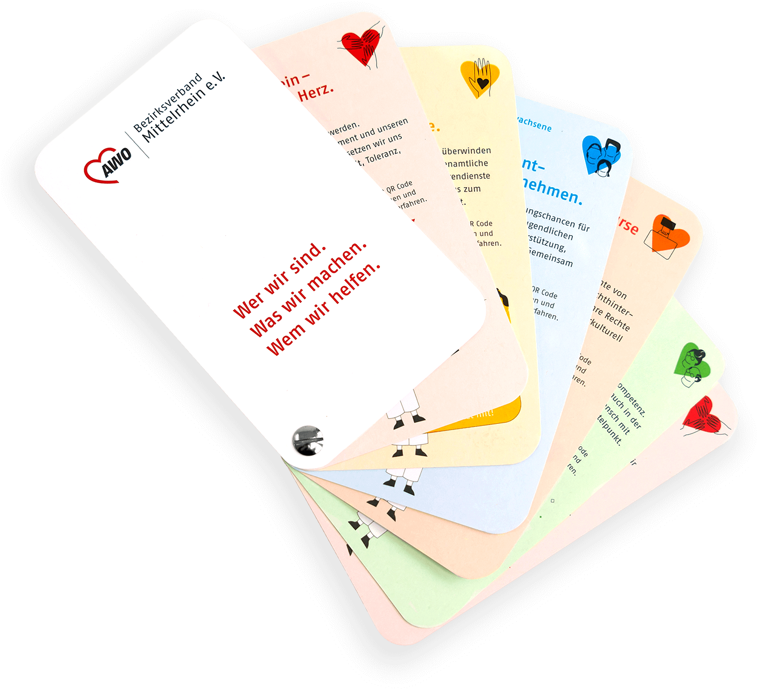
An orderly structure through clear colour clusters of the AWO Mittelrhein departments was a central component of the careful brand design adaptation. This was accompanied by the development of an individual illustration style. However, the central aspect of the relaunch was the first stringent use of the newly defined design parameters in all communication channels.
The new visual language of AWO Mittelrhein
An independent and lively look characterises the new visual language of AWO Mittelrhein. The consistent use of primary and secondary colours within all corporate design parameters promotes the coherent and structured appearance.
Tease analogue. Digitally deepen.
Disciplines
Branding concept
Corporate design
Illustration
Iconography
Animation
Similar initial situation?
Many of our projects start with a concrete situation — not with a finished brief. If what you’ve seen here resonates with you, let’s have a short conversation.
Alexander Willuweit takes 30 minutes to understand where you stand — and whether we are the right partner for your next step. No pitch. No pressure.