For AWO Mittelrhein, CRENEO developed the digital services of AWO Mittelrhein – an independent digital presence as the parent brand of the network. The website was created as the first unit of the shared network system – on a REDAXO platform that today carries four independent presences.
Customer
Full-time Staff
Volunteers
Facilities/Services
Website Launch
AWO Mittelrhein
9.300
3.960
620
2020
0
Departments
0+
Subpages
0
Pages in Easy Language
0
Percent more unique page views
0
More visits per month (Sep 2020 to Sep 2025)
0
Languages (German/English)
One Organisation. Many Target Groups. One Digital Presence.
Initial situation
AWO Mittelrhein is one of the largest district associations in Germany – approximately 19,670 members in around 150 local associations and eight district associations, plus subsidiaries, specialist services and a broad range of offerings from care to counselling and education. At the same time, the people who visit the digital presence have very different needs: they are looking for care services, counselling, information about volunteering, career opportunities or want to become members. The existing presence did not meet these expectations – it failed to reach new and younger target groups adequately and barely stood out from other associations.
Challenge
The digital services of AWO Mittelrhein had to address an unusually broad target group simultaneously: senior citizens and people in need of care, families with children, volunteers, applicants as well as politicians and multipliers from the social sector. At the same time, the new presence needed to respect the formal language of the AWO, while clearly standing out from other associations – open and inviting, structured and modern, independent within the segment.
Objectives
The goal was a digital presence that makes the diversity of AWO Mittelrhein visible – and encourages people to get involved.
Attract new and younger target groups to AWO Mittelrhein
Actively promote voluntary engagement and membership
Present six specialist areas in a clearly structured and findable way
Develop an independent visual identity within the AWO brand family
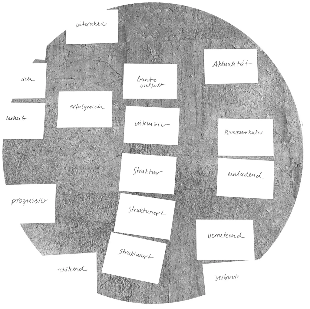
Two workshops to develop the AWO Mittelrhein goals
The new appearance should take into account the formal language of AWO, but also clearly stand out from the existing appearances within the segment. An open and inviting look, structured preparation of information and offers, a modern visual language as well as a high performance were objectives. In order to concretise these and other goals and at the same time gain a better understanding of the future direction of AWO Mittelrhein, 2 workshops were held.
Website AWO Mittelrhein – Expectations for the new digital presence
During the workshop, the participants were asked about their expectations of the new digital presence. Through multiple responses, key areas emerged and could be taken into account for the future orientation.
Implementation
High user-friendliness meets a strong and independent appearance.
The interface design of AWO Mittelrhein. Within the user interface, ordered structures, high clarity and stimulating impulses form the basis for the new visual digital presences of AWO Mittelrhein. The building blocks developed here – illustration world, icon set, colour system – thus formed the foundation for all further units of the platform.
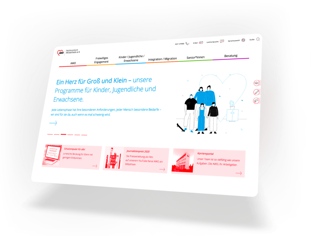
Above the Fold
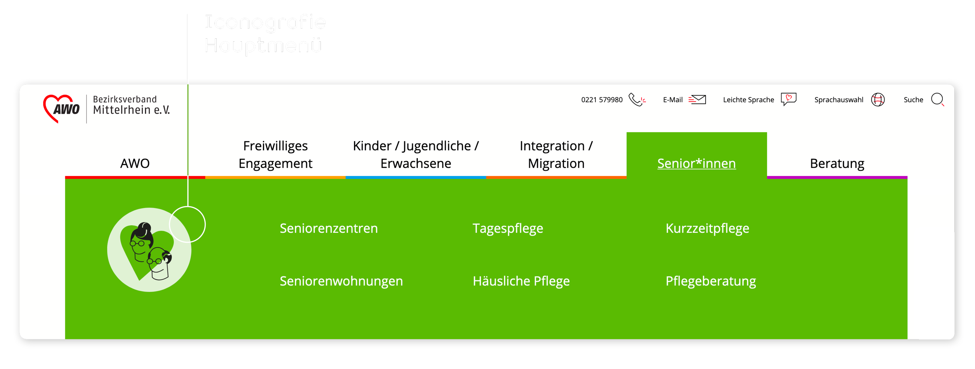
In the first visible area of the landing page, a slider functions as a quick entry point for the individual subject areas. 3 further info boxes can be individually provided with varying content. The mega menu is clearly structured and picks up on the colour coding that runs through the entire website.
Clear user guidance paired with a modern and independent appearance
Ordered structures, high clarity and vivid visual impulses within the user interface form the basis for the new visual language of AWO Mittelrhein. Colour coding and clearly structured typographic hierarchies thereby create a high degree of orientation.
Colour Palette
In addition, the colour palette was marginally adjusted and extended with an additional colour. Detailed information can be found under “AWO Corporate Design”.
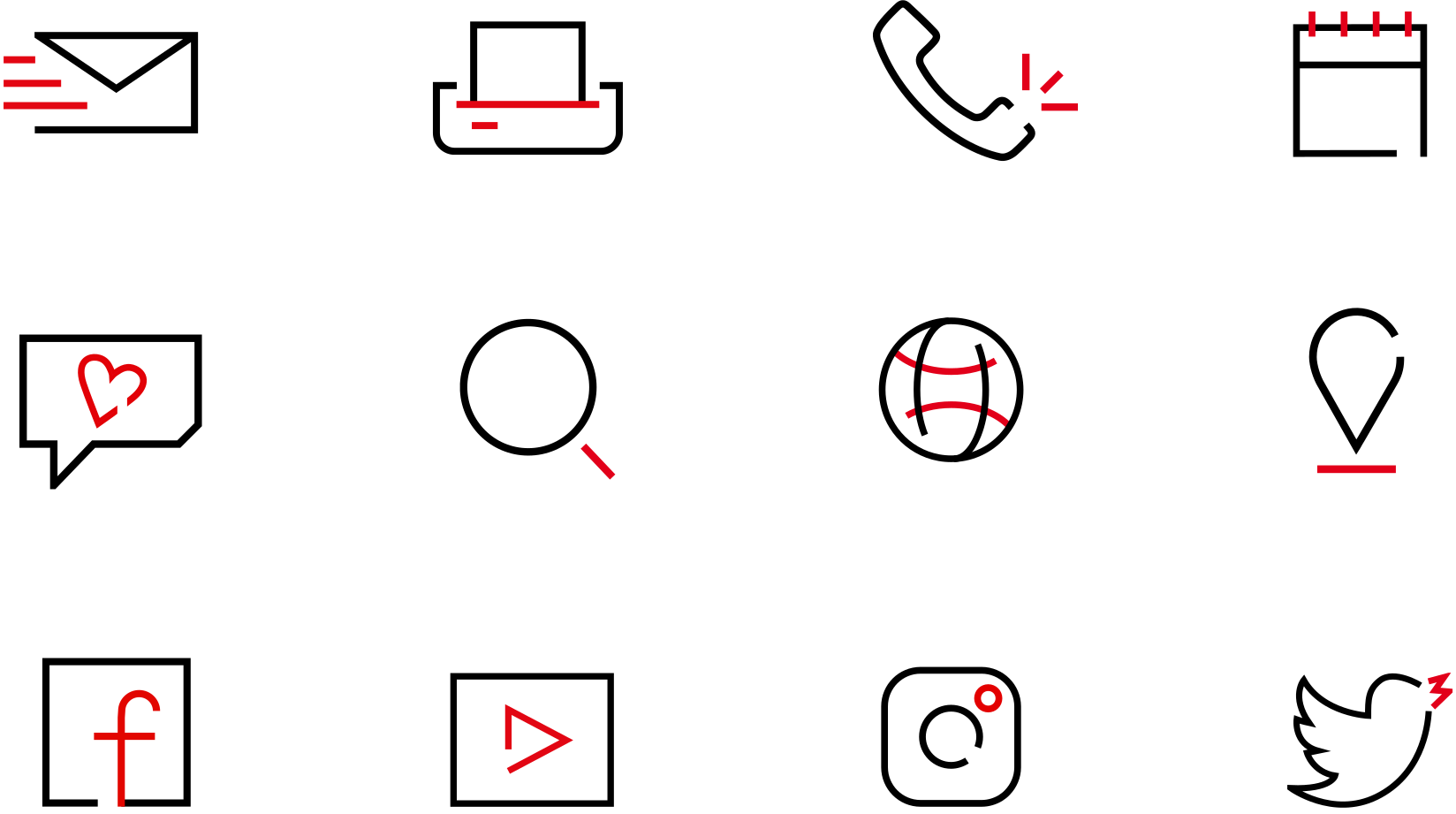
An individual icon set was developed specifically for AWO Mittelrhein.
Clear orientation in menu navigation through the development of individual icons for all six departments
Icons thus serve as an additional differentiating element for the individual divisions within the mega menu.
Inspire people
One of the main goals of the new image was to get people to join in. People who volunteer are indispensable for the AWO. They provide self-help support, engage in socio-political work and thus advocate for the interests of socially disadvantaged people.
Getting Involved Made Easy.
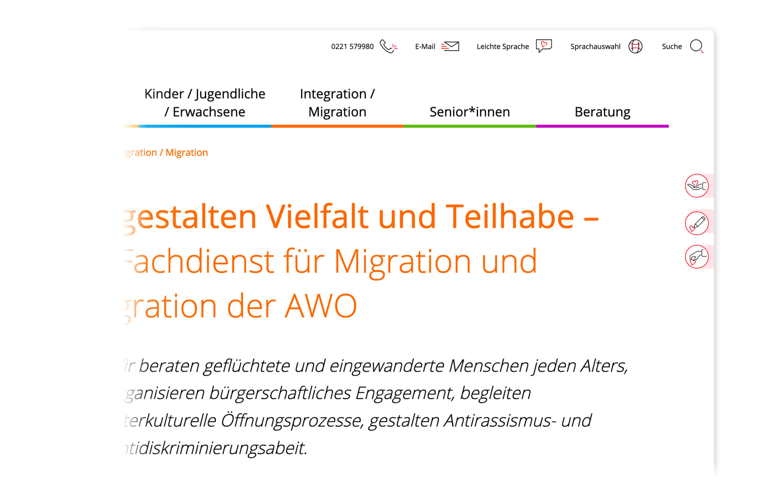
To attract new members, volunteers and donors for AWO Mittelrhein, permanently visible call-to-action buttons were therefore integrated.
Pleasant usability
Direct feedback, high contrast values and clear structures together sustainably improve the user experience.
Colourful illustrations for the diverse offers of AWO Mittelrhein
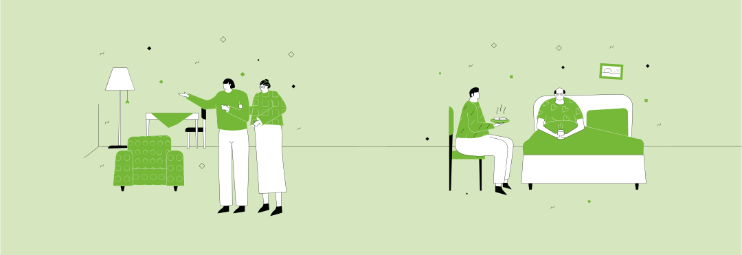
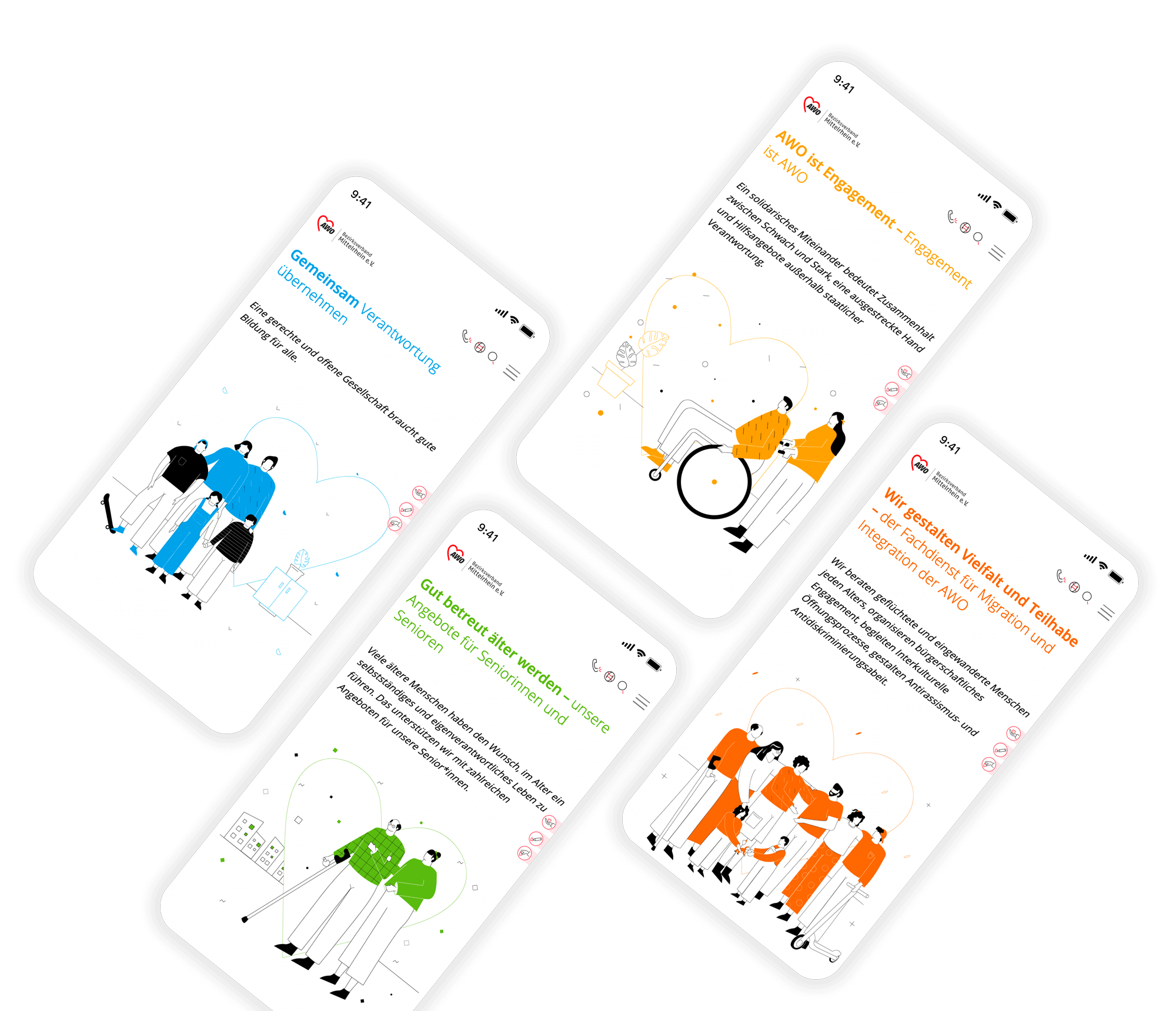
The illustration world developed specifically for AWO Mittelrhein creates an independent and modern visual identity. Through the visual language, a clear distinction from other institutions within the segment is thereby established. Animations additionally bring vitality to the digital services.
Clear and user-friendly
Even in reduced display sizes, the AWO Mittelrhein offer convinces through clarity and high usability.
„
The cooperation with CRENEO was a benefit for AWO Mittelrhein. The new digital offerings have far exceeded our expectations. We feel well positioned for the future with our websites.
Isolde Weber Head of Public Relations, AWO Bezirksverband Mittelrhein e. V.
Result
Greater Reach. Greater Impact. The Foundation for the Network.
The new digital presence of AWO Mittelrhein stands out independently – clearly differentiated from other associations, with six colour-coded specialist areas and a navigation structure that addresses members, volunteers and new target groups equally. The illustration world and icon set additionally create a visual language that can be used consistently across all channels. The results therefore speak for themselves: +1,357% more unique page views and +10,700 more visits per month – measured from September 2020 to September 2025. 110+ subpages in eight easy-language versions are thereby maintained independently – as the foundation on which the entire network has been built.