The FUNKE brand presence — from analogue to digital
The orchestrated visual appearance reflects the company’s values, vision and mission. From analogue to digital, a consistent presence strengthens external perception and at the same time makes the affiliation of each sub-brand clear. The FUNKE brand presence is not created anew but derived from the parameters of the corporate design — from FUNKE business stationery through to moving image, applied differently for each medium, yet everywhere according to the same rules.
Business equipment
Standardised group-wide, delivered automatically
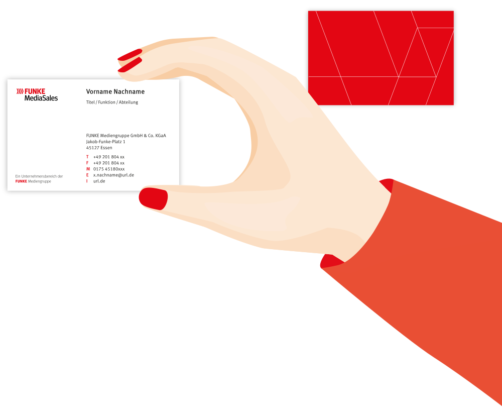
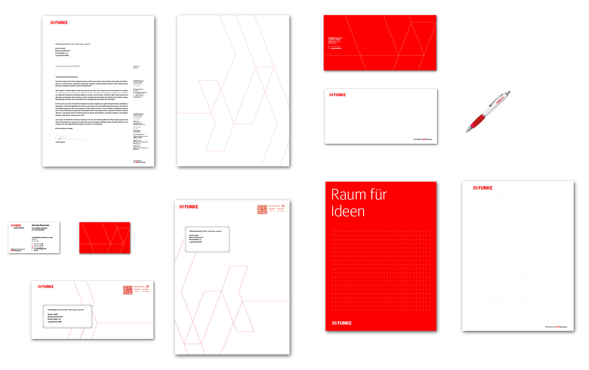
CRENEO standardised FUNKE business stationery across the group for the first time and made it available through web-to-print automation. As a result, the individual product brands now follow the same formal structure.
Centralisation also reduces errors, effort and cost. Anyone who needs a business card simply orders it — instead of having it designed.
Print
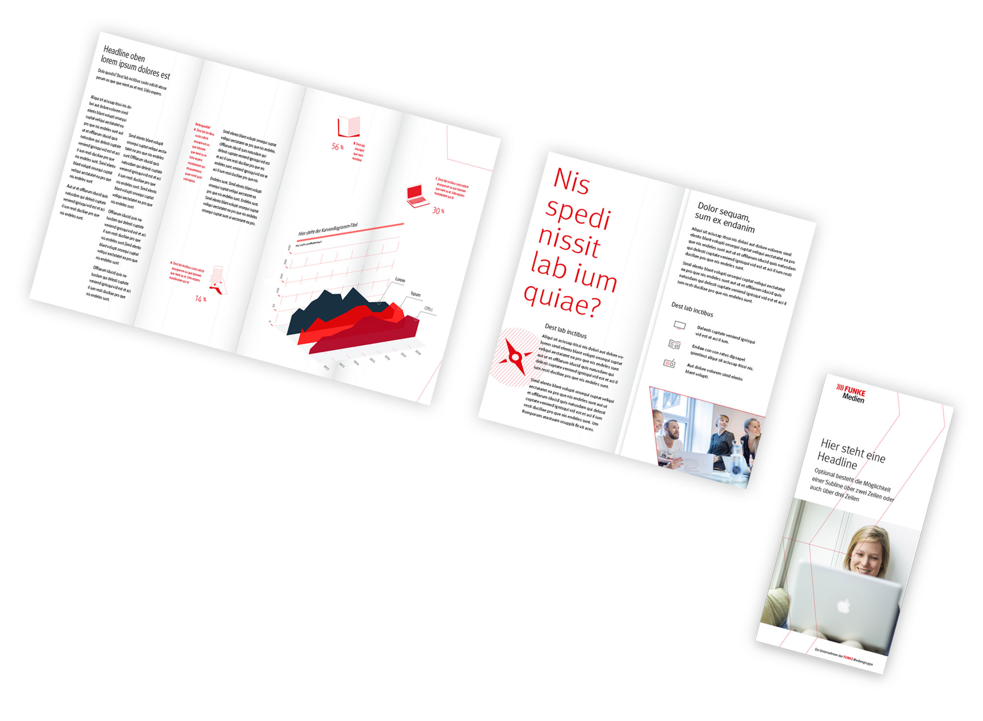
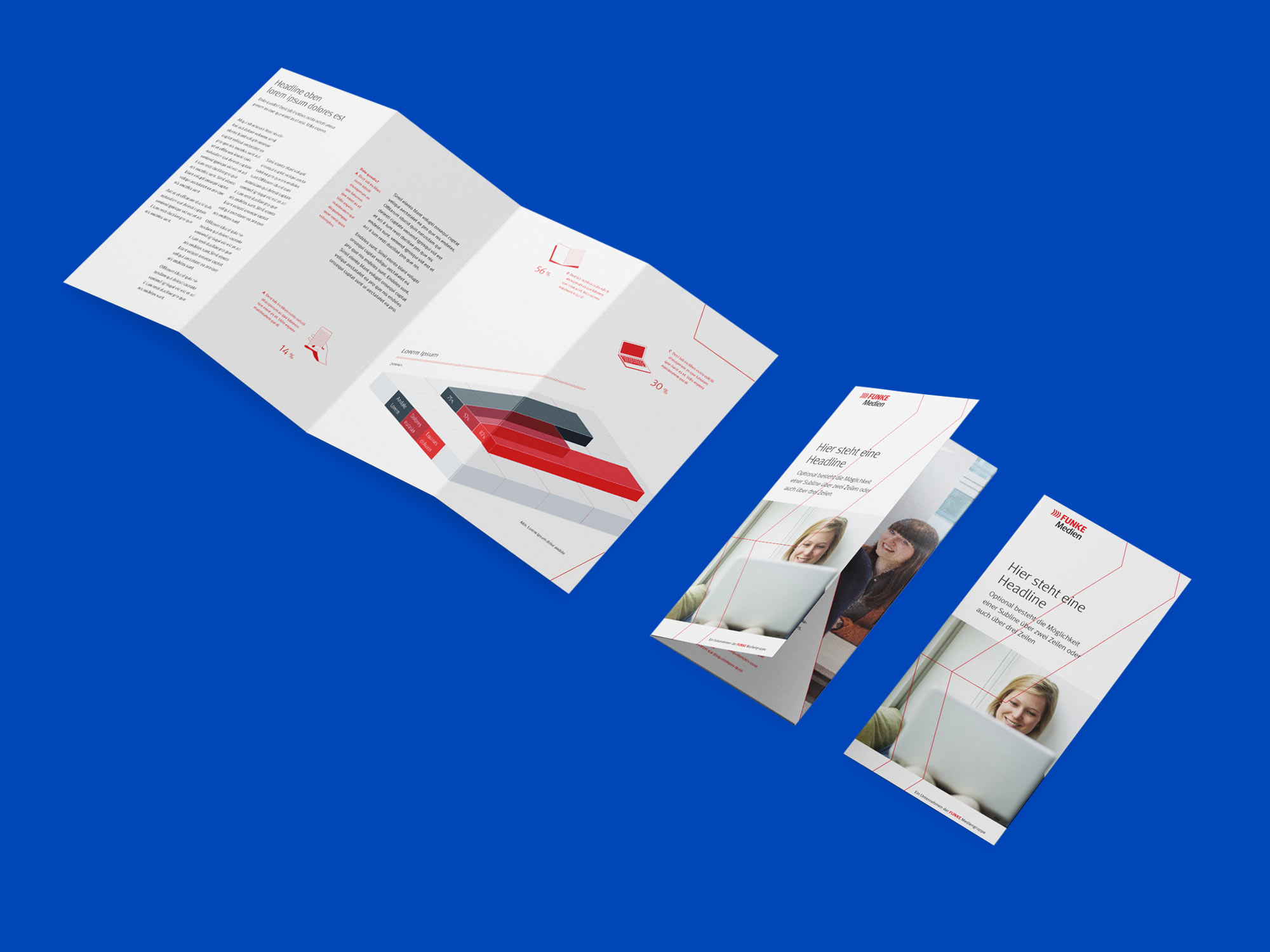
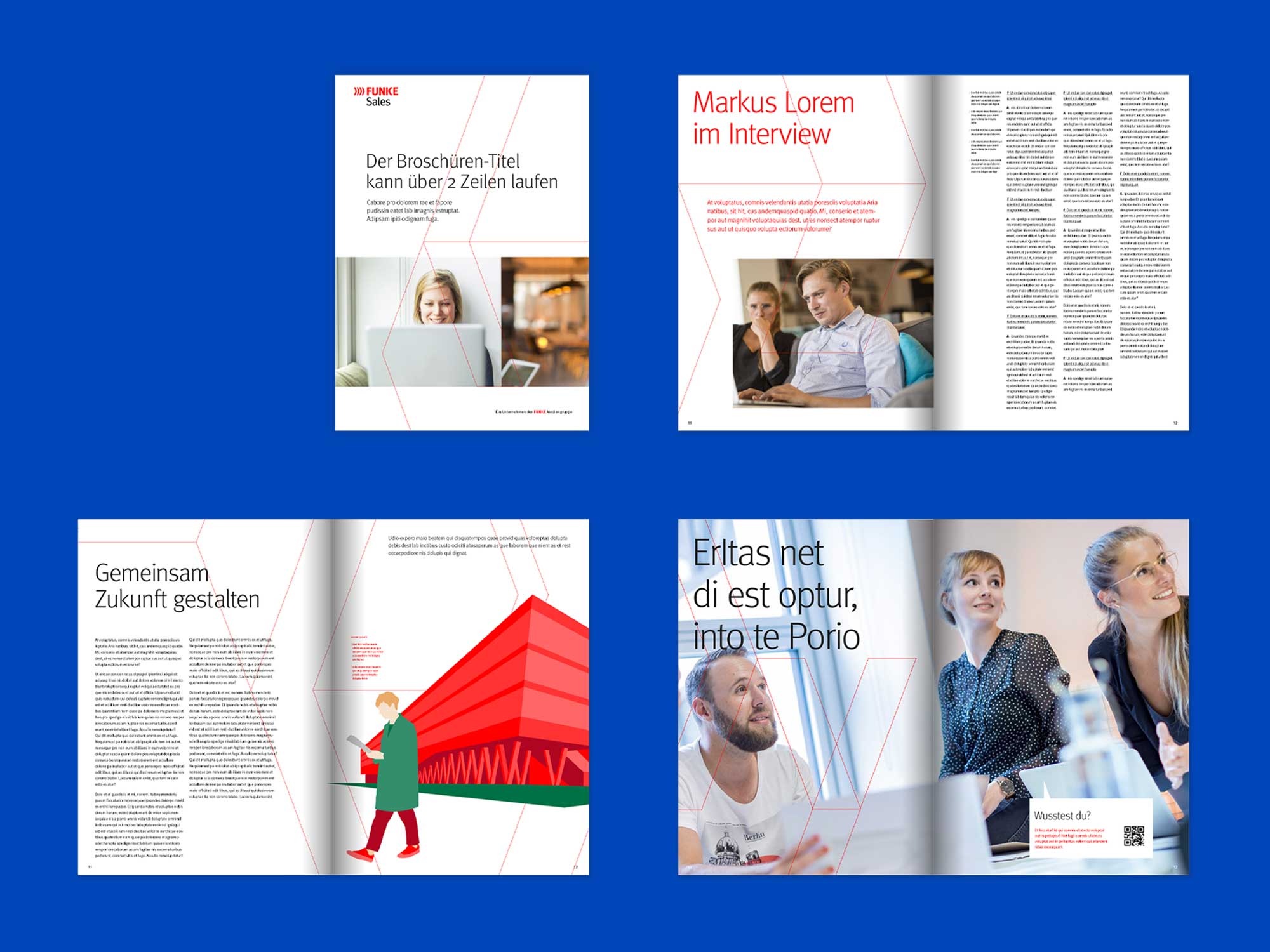
Brochures and flyers
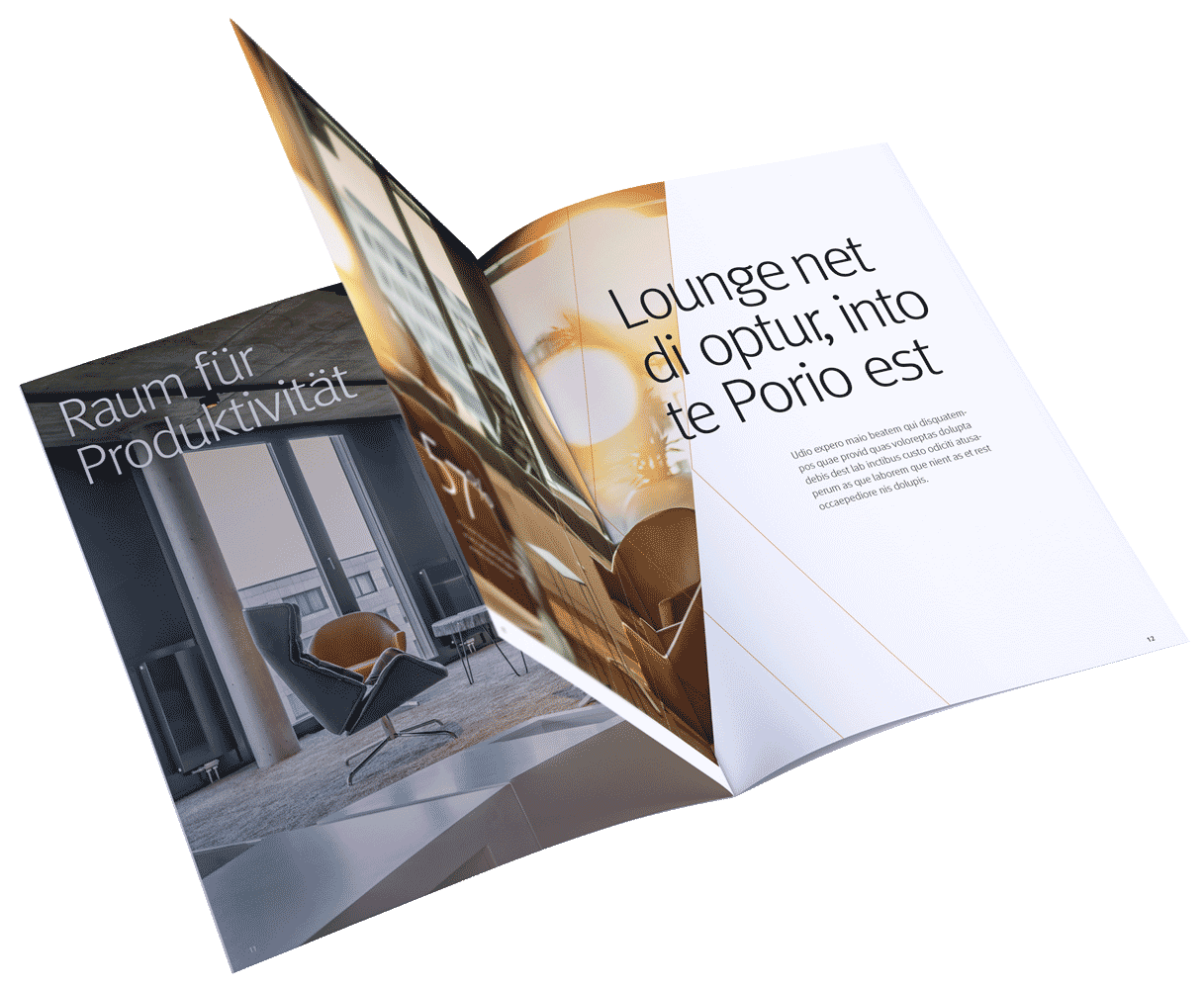
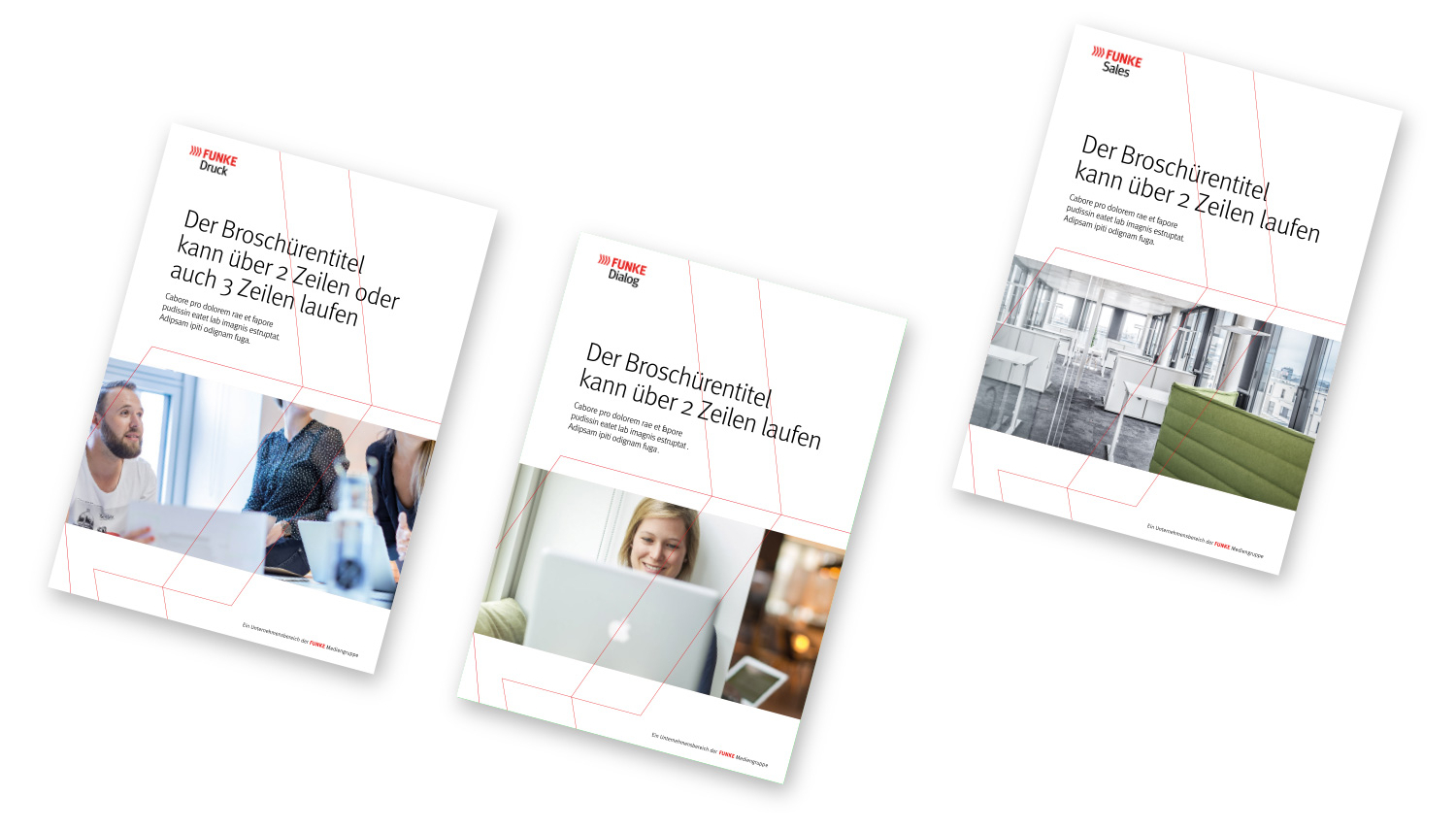
The corporate design manual sets out how print media are handled across all common formats. Master templates were developed alongside it and are available through a digital interface.
No brochure therefore starts from a blank page. Grid, type area and image areas are already fixed, and design happens within that framework.
Out-of-Home
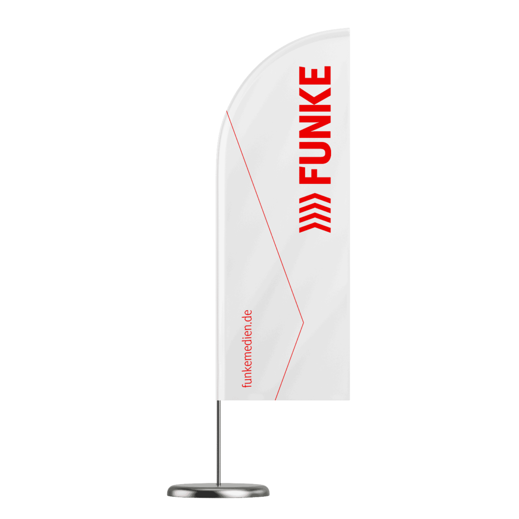
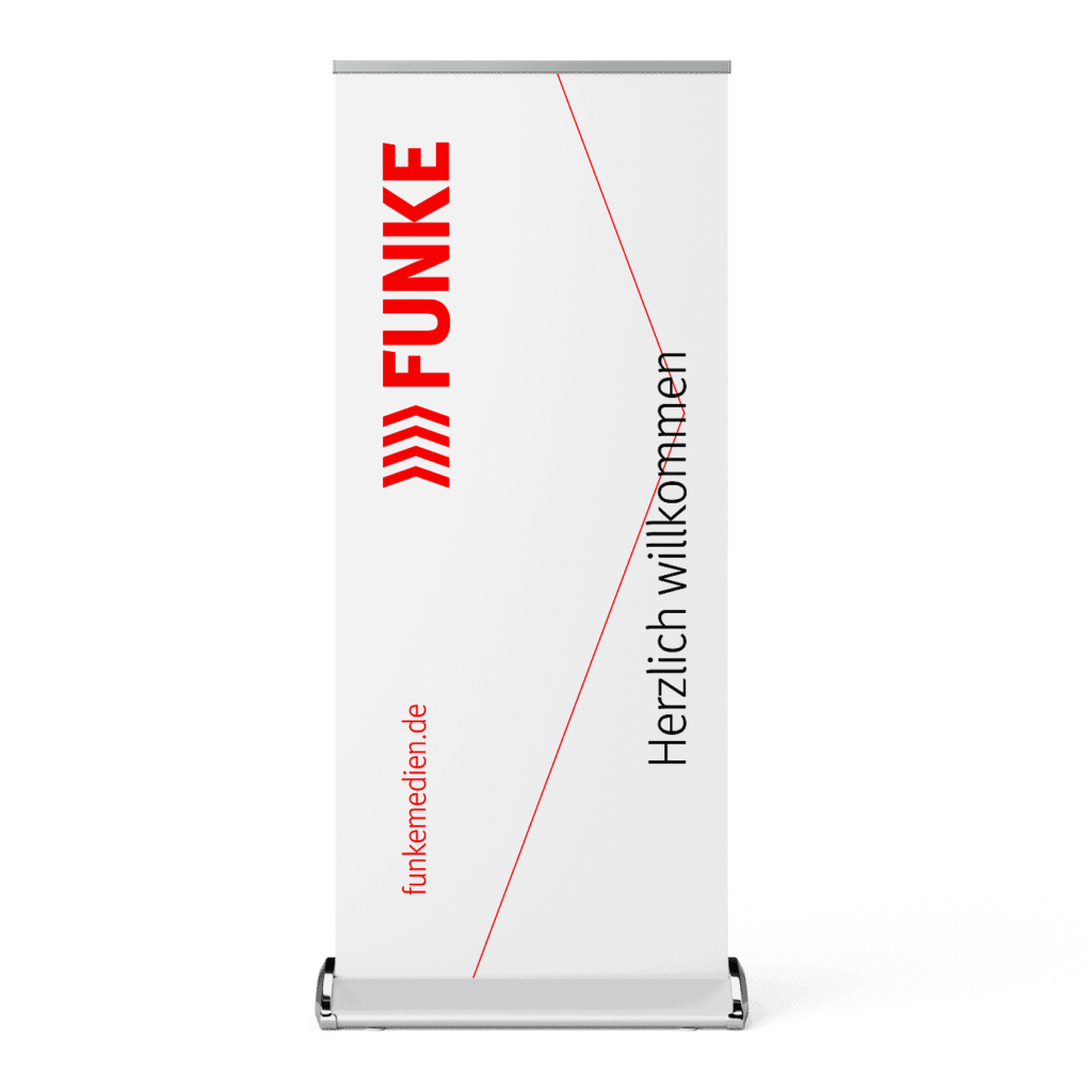
Large formats under the same rules
For large-format advertising spaces such as megalights, citylights or posters, the formal specifications can also be retrieved digitally. The same layout system applies as in print — only the line weight of the secondary brand element adjusts proportionally.
Merchandising
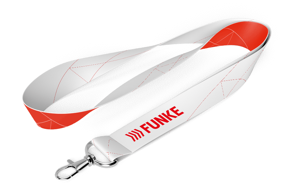
From lanyard to trade fair stand
Promotional items for FUNKE and its sub-brands follow the new design guidelines too. CRENEO developed a range of brandings for this purpose, which are now collected in the newly published FUNKE merchandise catalogue.
One rule derives directly from the colour palette: the base tone of the products to be branded must harmonise with the FUNKE colours. A logo on the wrong background weakens the brand rather than showing it.
Digital
Screen design
Whether presentation or social channel branding — the new brand language applies consistently across all channels. The same parameters that structure a brochure also structure a slide.
Motion picture
On-Air Design
Movement moves. CRENEO therefore carried the new brand design into moving image as well, using animation principles derived from the secondary brand element.
Every medium follows the same set of rules. What FUNKE publishes is recognisable as FUNKE — from letterhead to blow-up.