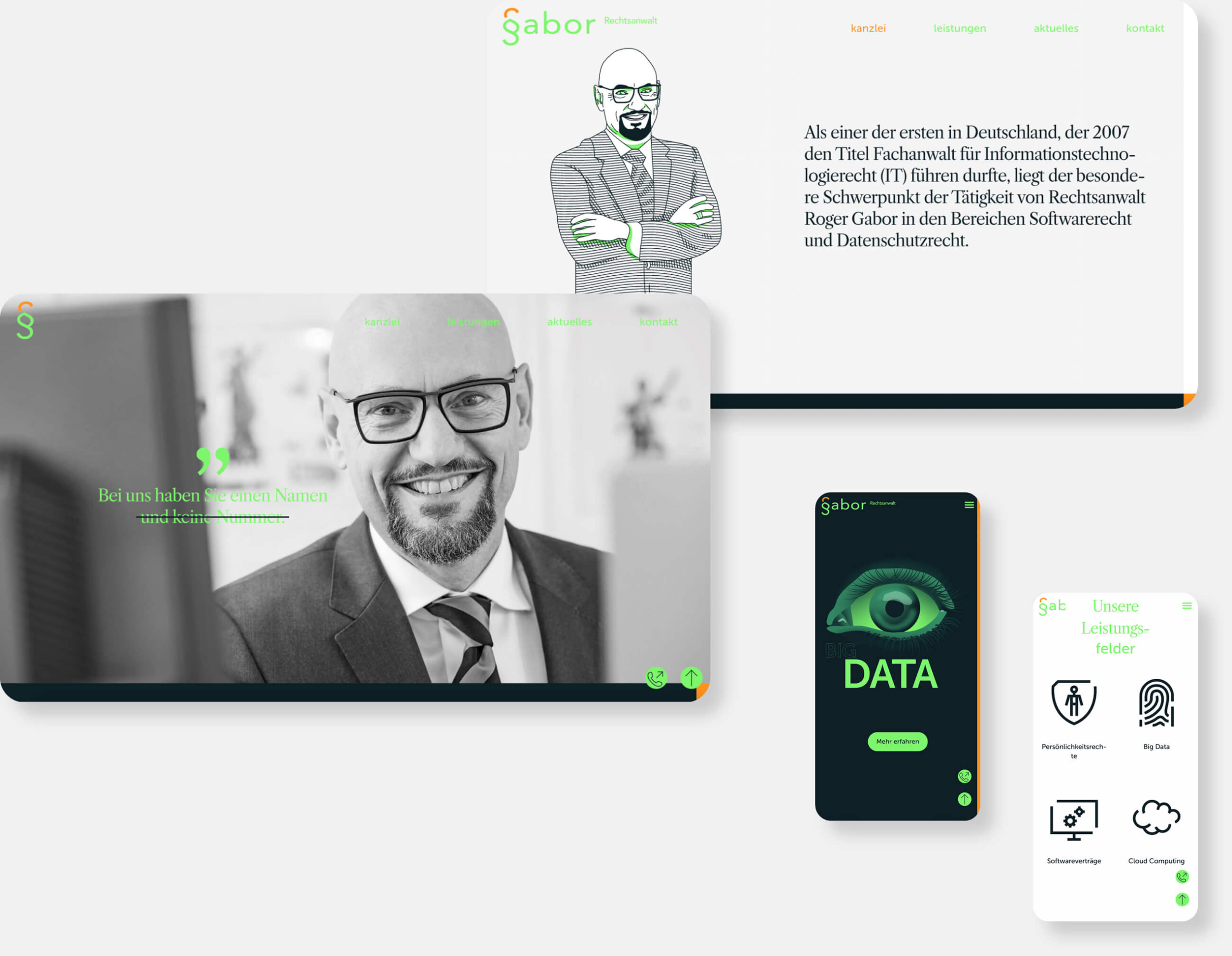
GABOR — specialist lawyer for information technology
As one of the first in Germany to be awarded the title of specialist lawyer for information technology law (IT) in 2007, the particular focus of lawyer Roger Gabor’s work lies in the areas of software law and data protection law. Leading automotive supply groups, companies from the industrial and service sectors, software houses, advertising and communications agencies, call centers, hospitals, web stores, traditionally the vehicle trade, suppliers to the commercial vehicle and automotive industries, large district towns and municipalities, as well as publishing houses trust in the expertise of Roger Gabor, for whom IP and IT rights are enforced, especially in source code disputes.
The goal was a reduced web presence focused on the range of services offered. At the same time, the creation was to clearly convey the firm’s field of activity.
Picture-word mark
Logo
The new logo brings the segmentation to the point. The harmonious unity between the paragraph sign and the first letter of the lawyer’s name results in a simple and striking figurative mark. Within the website, the image-word mark is reduced to the pure image mark by means of a scroll animation. In the future, this will also function as a profile picture within social networks, as a favicon or as a three-dimensional design element in various communication channels.
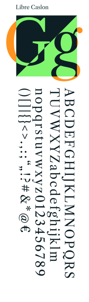
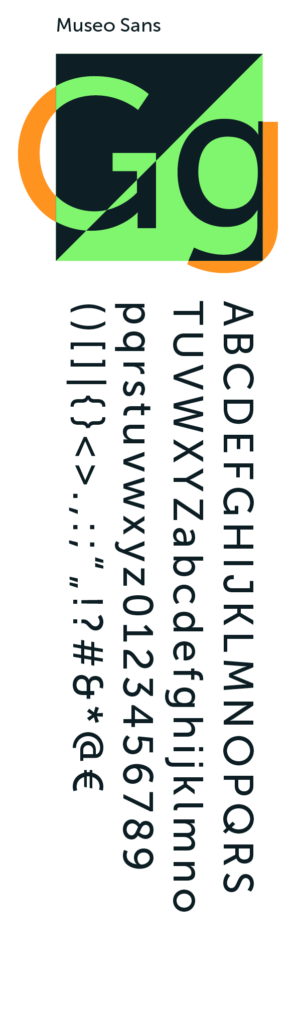
Typography
In the future, 2 font classes will be used: a linear and a serif font. This will create a field of tension within the typography. This will create a field of tension within the typography.
Colour world
#0C1E24
#0C1E24
#80F56E
#FF931F
#F0F0F0
#FFFFFF
Colour world
The colour world lives from its valuable and technical impression. The muted green is flanked by a bright “digital green”. The other primary colour “orange” sets accents and also functions as a navigation colour. The colour climate within all design channels thrives on the generous use of light and dark areas.
Iconography
Icons developed especially for the client are given micro animations within the new website.
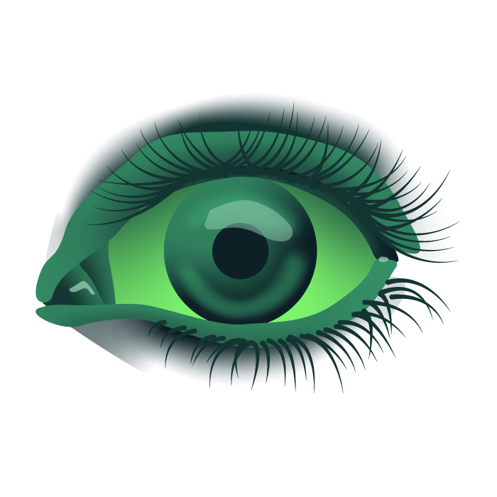
Illustration world
The illustration world picks up the new colour spectrum and receives an additional narrative level through scroll triggers in the web presence. A monotone image world is used as a counterpoint to the colourful graphic elements. This is supplemented in the header images by an interference effect in order to build a subtle bridge to the specialist area of the law firm here as well, or to support it on the visual level.
Result
The new corporate design lives from its technically appealing but at the same time valuable colour world, the monotonous imagery and a reduced handling of all design elements. The new logo gets to the heart of the segmentation.
Microanimation within the new web presence and the use of illustrations support the individual digital subject areas of the law firm. The generous use of typography including the mixing of 2 font classes creates additional tension within the website accents and at the same time functions as a navigation colour tone. The colour climate within all design channels lives from the generous use of light and dark areas.
Many of our projects start with a concrete situation — not with a finished brief. If what you’ve seen here resonates with you, let’s have a short conversation.
Alexander Willuweit takes 30 minutes to understand where you stand — and whether we are the right partner for your next step. No pitch. No pressure.