Brand and web design for the travel provider Local Vibes Yoga
Brand and web design for the travel provider Local Vibes Yoga
Initial situation
A travel company with character
The fresh brand design of Local Vibes Yoga aims to convey both calmness and emotionality. To this end, characteristics of yoga culture were first analysed.
In order to appeal to an extremely specific target group that is open to the more high-priced offers, it is important to present them appropriately. One of the reasons for this is the high information density with very detailed descriptions of sights and accommodation. In this way, the travel experience is made tangible and conveyed emotionally. The Local Vibes Yoga brand design creates a homogeneous and appealing overall impression for the top target group and emphasises the luxurious nature of the trips on offer.
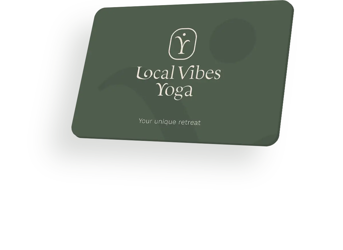
Construction of the figurative mark
The three initial letters L, V and Y were combined to create a unique figurative mark. Clever tapering and curved lines create a harmonious overall look that is reminiscent of a stylised yoga pose. This combination gives the brand a special aura and at the same time symbolises lightness, movement and balance.
Picture-word mark
Picture-word mark
Special ligatures were developed for the design of the word mark, which take up elements of the Sanskrit script and thus create an authentic appearance. The use of these ligatures emphasises not only the aesthetics, but also the meaning and symbolism behind the yoga theme in a typographical way. This gives the brand a unique and appealing aura that is convincing both visually and in terms of content.
Clear space
The Clear space of the figurative word mark is of great importance. It creates a clear recognition value and ensures that the logo is given the necessary calm within the communication measures thanks to sufficient white space. The Clear space is defined by the total width of the figurative mark including the associated frame. This strengthens the impact and presence of the brand and ensures a uniform image.
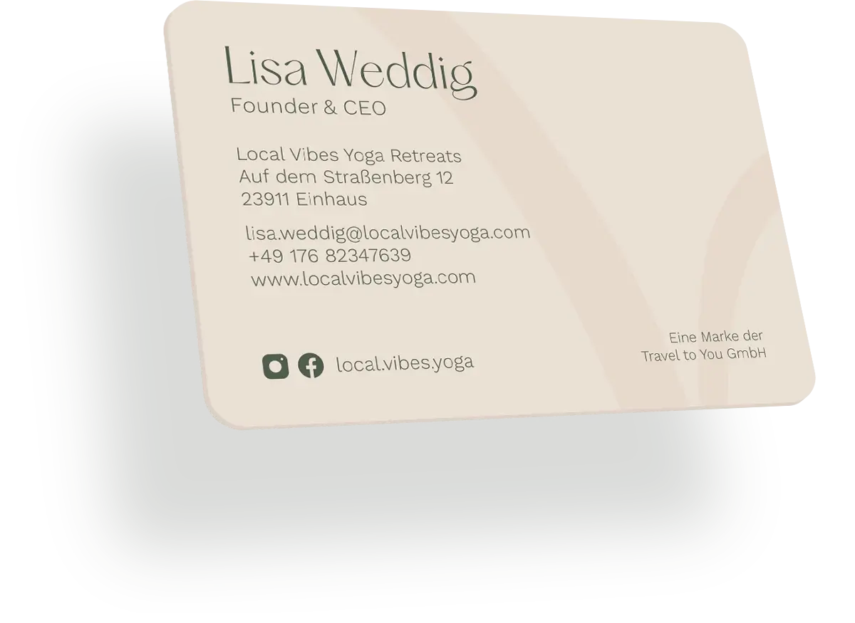
Colour world
The colour world is divided into primary and secondary colours. The primary colours include the intense dark green, which stands for tranquillity and closeness to nature, and the warm apricot, which creates a friendly atmosphere. The secondary colours of bright white, fresh light green and elegant champagne embody purity, vitality and elegance. Together they create a harmonious appearance with a calming and inspiring effect.
Icon set Illustrative
Icon set Informative*
*Consists mainly of coloured Google Material Symbols.
Visual language
The image design picks up on the large proportion of green in the colour scheme. The images of the locations also contain many fascinating details to arouse curiosity and generate interest in the places. The people depicted radiate friendliness in order to create a positive atmosphere and inspire the target audience.
Result
The new brand design of Local Vibes Yoga impresses with its unique combination of soft, appealing elements and a wealth of high-quality information. This special harmony is evident in every detail of the company’s digital brand presence, creating an inviting and informative atmosphere for visitors.
The large number of call-to-actions placed on the website means that they are always offered the opportunity to enter the booking process directly. A complex booking system that offers a high degree of customisation fully meets the requirements profile and allows users to select tailor-made booking offers and go through a simple and convenient booking process with just a few clicks.
Result
„
CRENEO successfully mastered the extensive booking process, delivering an impressive brand design that is both functional and aesthetically pleasing. This project is an example of how design and technology can flow together harmoniously to successfully establish our new Local Vibes Yoga brand on the market.
Many of our projects start with a concrete situation — not with a finished brief. If what you’ve seen here resonates with you, let’s have a short conversation.
Alexander Willuweit takes 30 minutes to understand where you stand — and whether we are the right partner for your next step. No pitch. No pressure.