We were commissioned to develop a new brand design for the photographer and videographer Dominic Quambusch.
The task was to develop a simplified and attention-grabbing image that, through its reduction and at the same time strong characteristic, does not distract from the client’s work but discreetly flanks it.
Figurative mark
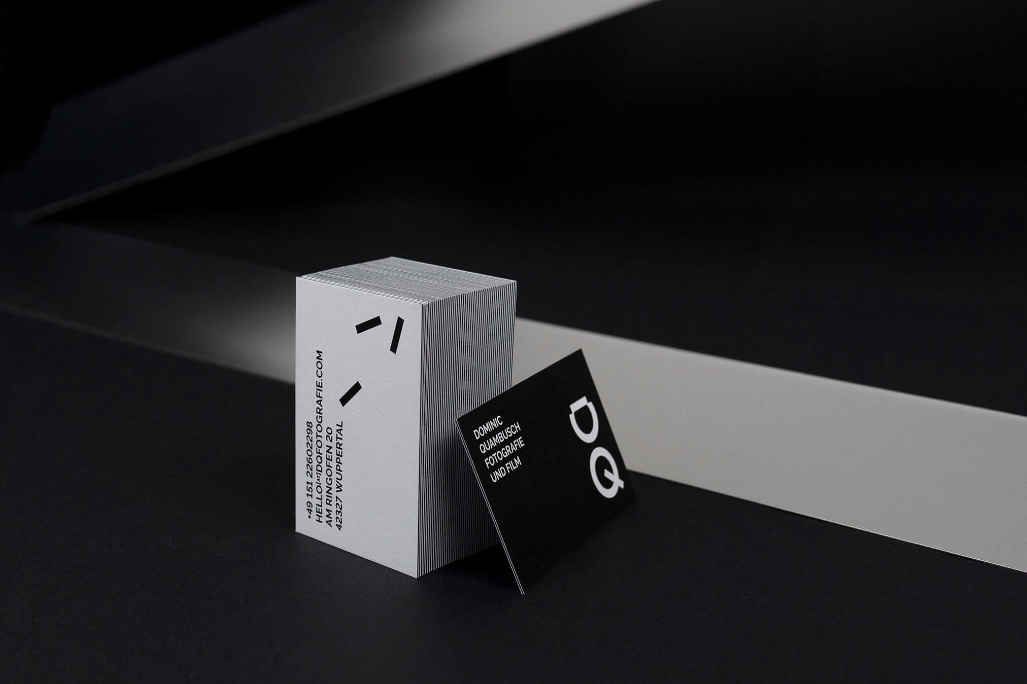
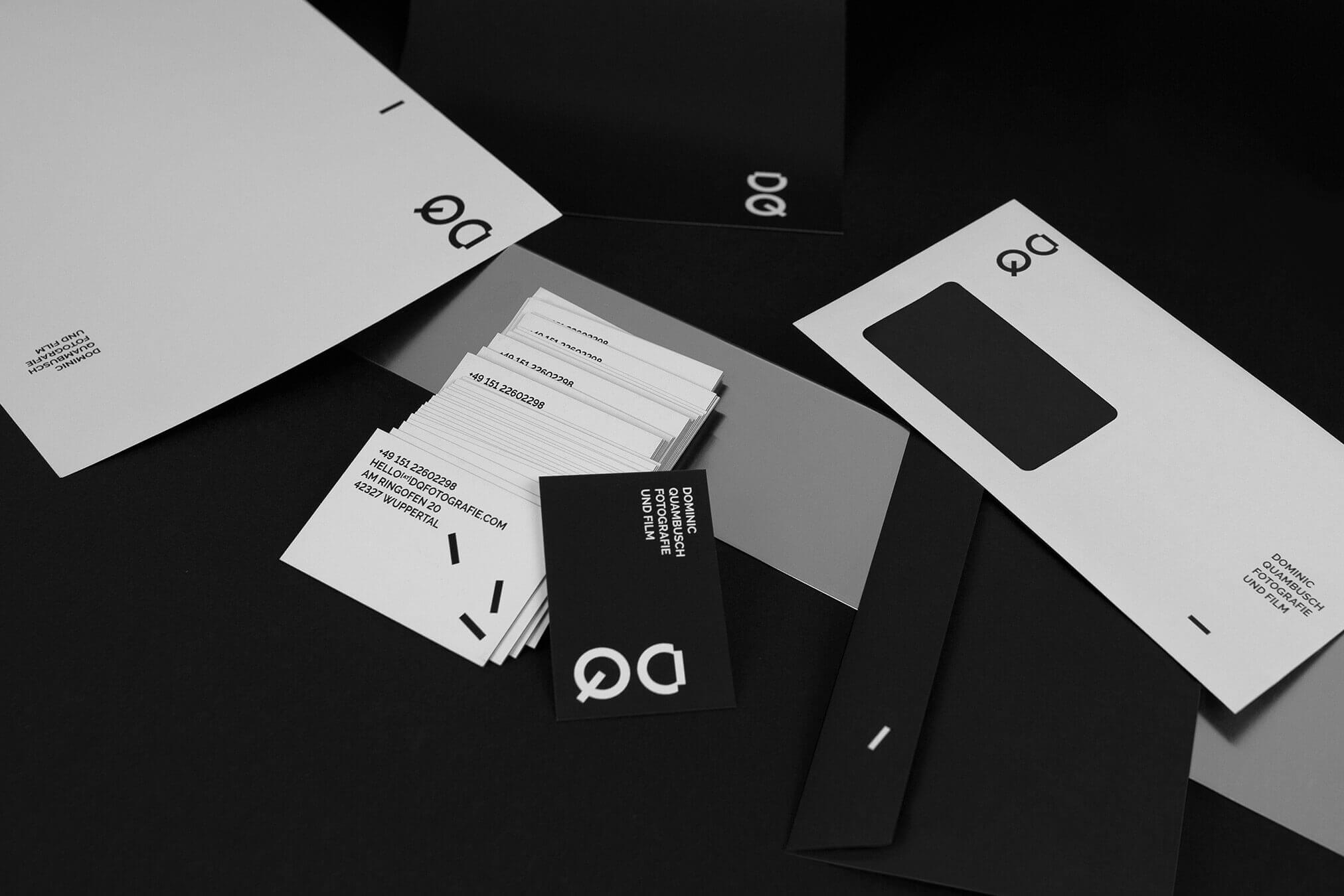
As a solution, a monogram was developed from the first letters of the first and last name Dominic Quambusch. The shapes of the letters are constructed in a simplified way and quote buttons and setting keys of photo and film cameras.
The secondary brand element
Small rectangles symbolising abstracted architectural buildings or referring to the constructivism of the segment break through the grid of the remaining visual communication elements in their arrangement.
Business equipment
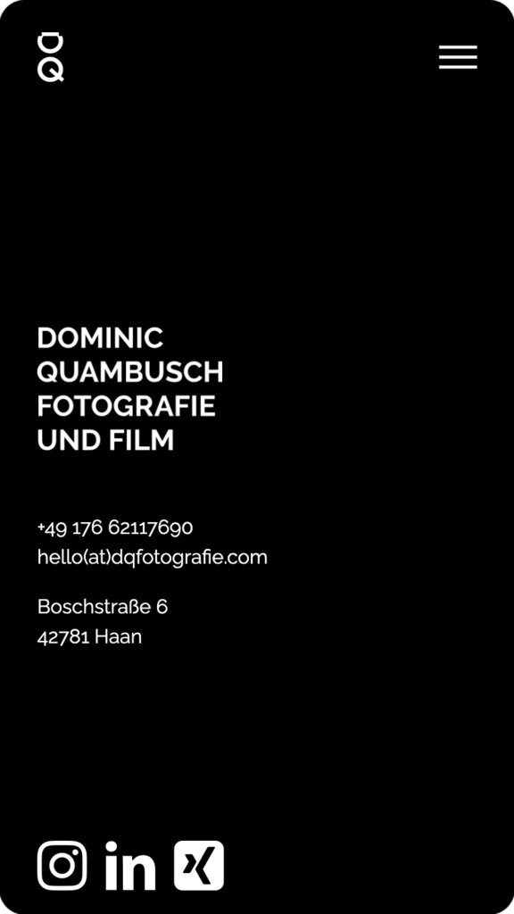
The monogram is flanked by the word mark “DOMINIC QUAMBUSCH PHOTOGRAPHY AND FILM”. The monogram, word mark and secondary brand element are flexibly arranged on the respective visible surfaces. The entire brand design impresses with a reduced design that directs the clear focus on the photographer’s work.
Business equipment
The monogram is flanked by the word mark “DOMINIC QUAMBUSCH PHOTOGRAPHY AND FILM”. The monogram, word mark and secondary brand element are flexibly arranged on the respective visible surfaces. The entire brand design impresses with a reduced design that directs the clear focus on the photographer’s work
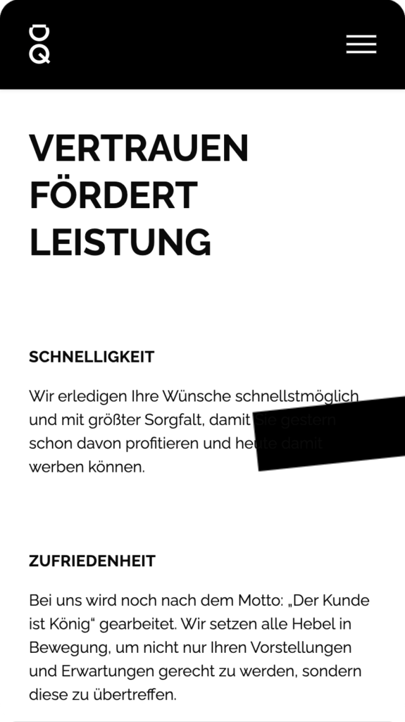
Concept and realisation of the website
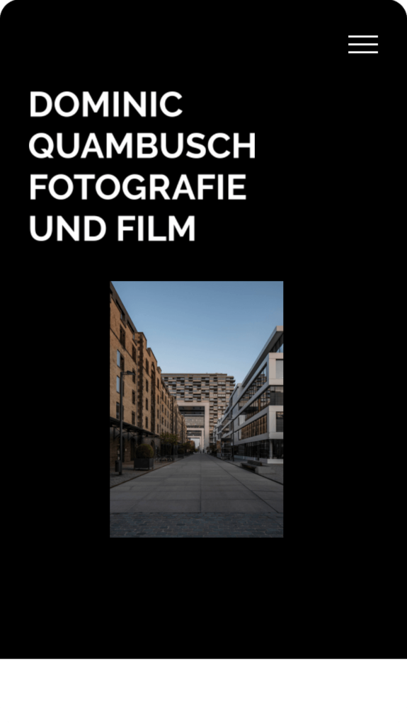
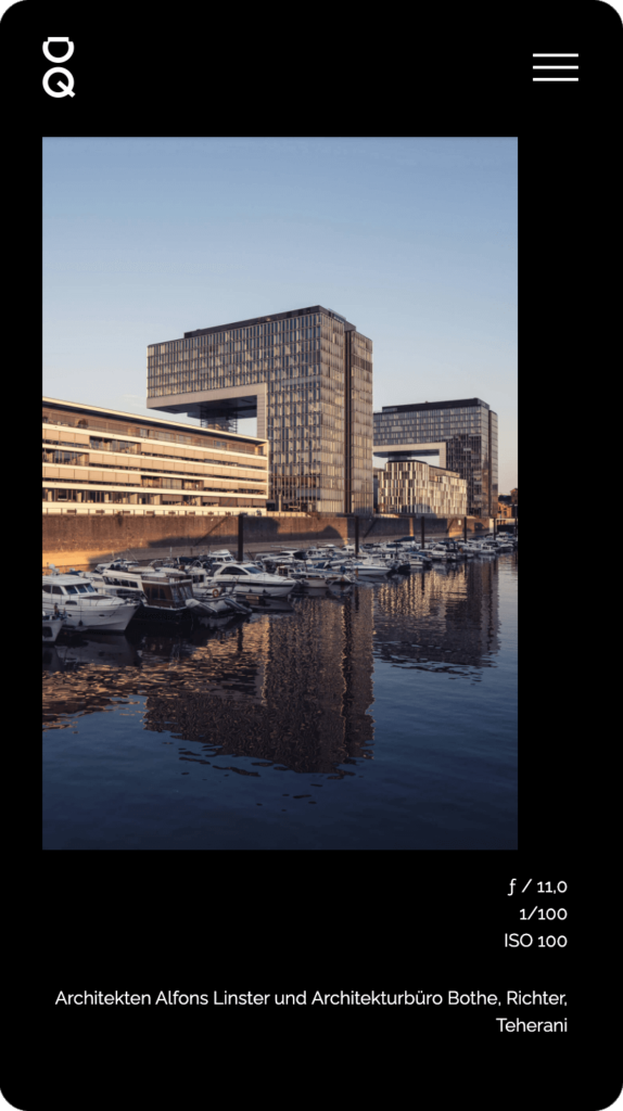
This design principle is consistently continued on the website. Here, the client’s photographic works break away from a rigid display grid and instead move freely on the respective visible tableau. Aperture, ISO and exposure time infor-mation of individual works flank the photos and at the same time act as a discreet typographic design element.
The response to the new image has been consistently positive. After publication, photographer Dominic Quambusch was able to generate a large number of new orders. A mailing based on our new brand design as well as the website in the form of a digital business card acted as a decision-making aid for new clients.
The response to the new image has been consistently positive. After publication, photographer Dominic Quambusch was able to generate a large number of new orders. A mailing based on our new brand design as well as the website in the form of a digital business card acted as a decision-making aid for new clients.
„
The absolute reduction through colour and form reveals the conciseness of a strong visual identity.
Alexander Willuweit Managing Director / Creative Director, CRENEO
Many of our projects start with a concrete situation — not with a finished brief. If what you’ve seen here resonates with you, let’s have a short conversation.
Alexander Willuweit takes 30 minutes to understand where you stand — and whether we are the right partner for your next step. No pitch. No pressure.