Starting point for future-oriented brand communication
DSE GmbH, now AWO WohnBau GmbH, has been responsible for construction and maintenance projects for AWO Mittelrhein since 2016. A half-day workshop was held together with CRENEO for the digital realignment. This served as the basis for the new corporate website, which specifically addresses various target groups.
Colour scheme
Familiar colors. New accent.
The AWO red remains the central identifying feature – in line with the AWO’s corporate design. For a modern and at the same time uniform external appearance, the AWO WohnBau color scheme was supplemented with calm shades of grey and the accent color “AWO Blue”. The latter is used specifically for buttons and links to increase user-friendliness. The result is a clear, serious look that makes the affiliation to AWO Mittelrhein visible and at the same time enables an independent, digital presence.
Design language
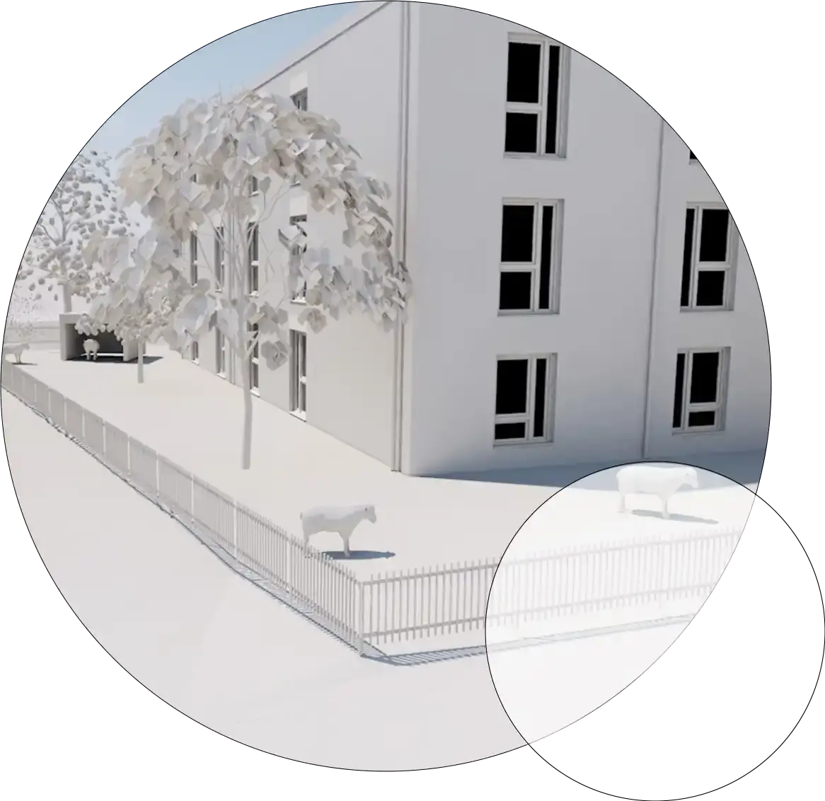
Architecture becomes design
Geometric shapes were derived from an architectural plan for the AWO WohnBau corporate website. They create orientation, take up the working environment in terms of design and strengthen the visual independence.
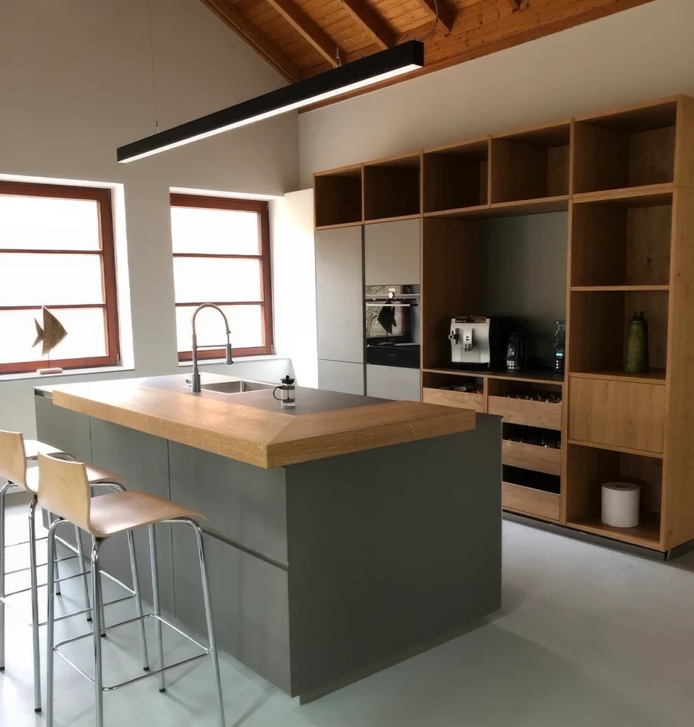
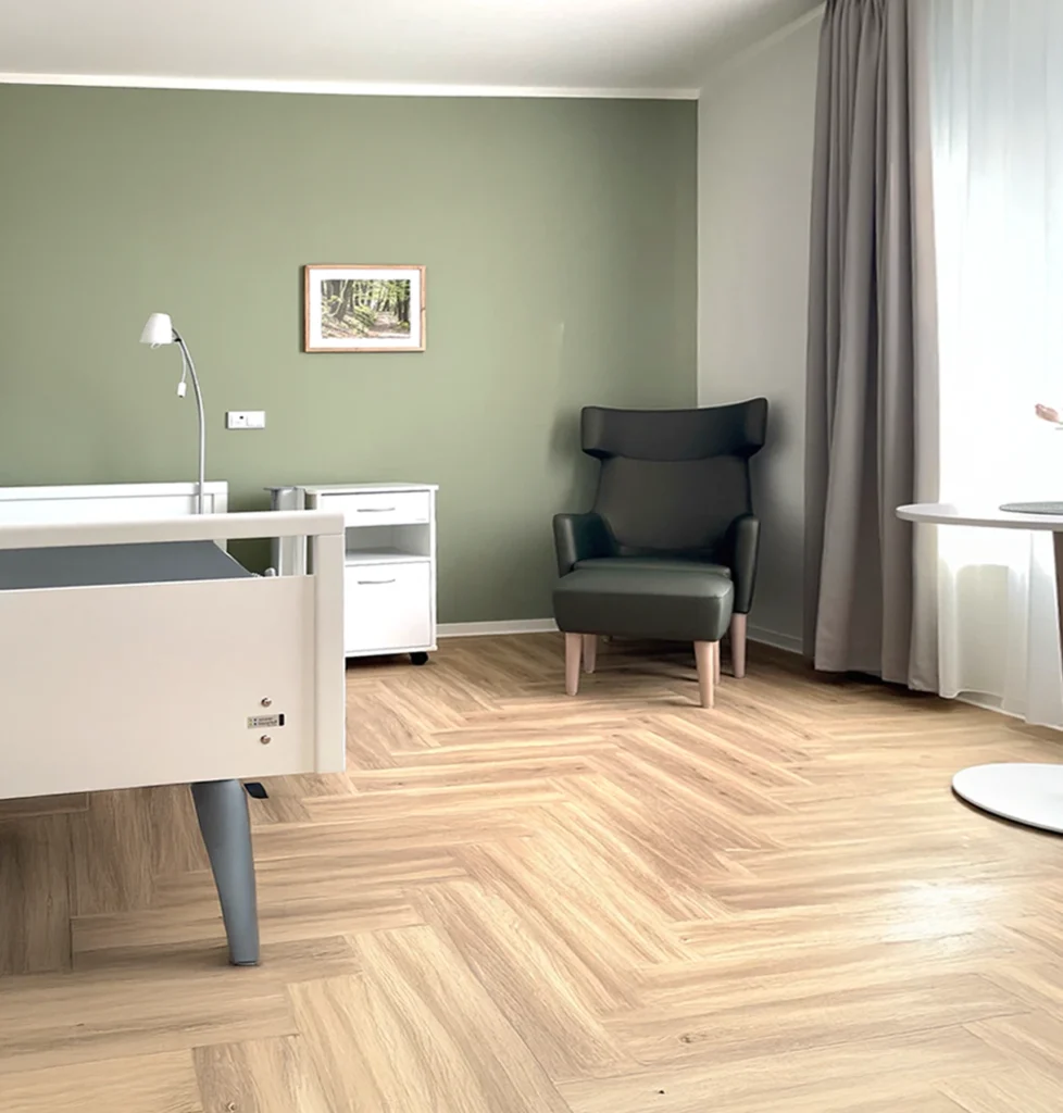
AWO WohnBau imagery
Visual language
Reduction with depth – the new visual language
Images were used specifically to support clarity and structure. Geometric shapes complement them as frames, fill areas or overlays. In some cases, images are set in circles or squares – for a striking and uniform look.
Copyright photos: HWR Architects
Unity in form and image
Design with a system
The website relies on a well thought-out visual language in which shapes are not just decorative, but have been functionally considered. As a connecting element, they interlock in image design, animation and illustration and give the website structural depth. This conceptual stringency makes the website not only consistent, but also independent within the AWO Mittelrhein cosmos.
Animation and illustration
Form meets function
Animations make project processes vivid and lively. Numbers and content are clearly structured using geometric shapes. The illustrations also follow the existing design language – and fit seamlessly into the visual concept.
Implementation
The AWO WohnBau corporate website as a sophisticated web experience
The AWO WohnBau corporate website impresses with its clear structure and uncluttered user guidance. The geometric design language is used consistently – as an image element, but also as a subtle background graphic. White space and blue tones complement the design and create a calm, harmonious overall picture.
Conclusion
Clearly aligned, purposefully designed
With the AWO WohnBau corporate website, a digital platform has been created that is conceptually well thought out, creatively independent and technically clearly implemented. It strengthens the positioning of AWO WohnBau in the digital space, specifically addresses the relevant target groups and at the same time fits seamlessly into the corporate design of AWO Mittelrhein. The consistent design language, the targeted use of color and image as well as the clear structure ensure a modern, trustworthy appearance with recognition value.