How do you modernise and rejuvenate the visual language of one of the largest AWO district associations in Germany? The solution: cautiously, progressively and consistently.
After extensive form studies, a new individual illustration style was created especially for AWO Mittelrhein. The retro attitude gives the illustration language a lightness and at the same time a high independent characteristic. Different patterns serve as condensation elements and give the illustrations additional structure.
At the same time, the motifs can be ideally animated without generating a large file size. This is a considerable advantage in the context of digital communication channels.
Icons with an illustrative feel were created for the individual AWO departments. They form the visual anchor of the individual service segments and build a bridge to the new individual AWO illustration world.
Image world Within the new visual world, image layers form a further component of the new visual language of AWO Mittelrhein. The depiction of a situation in different photographic settings nevertheless gives the static design tool liveliness. Accentuated colouring underlines the subject area in which the user is moving.
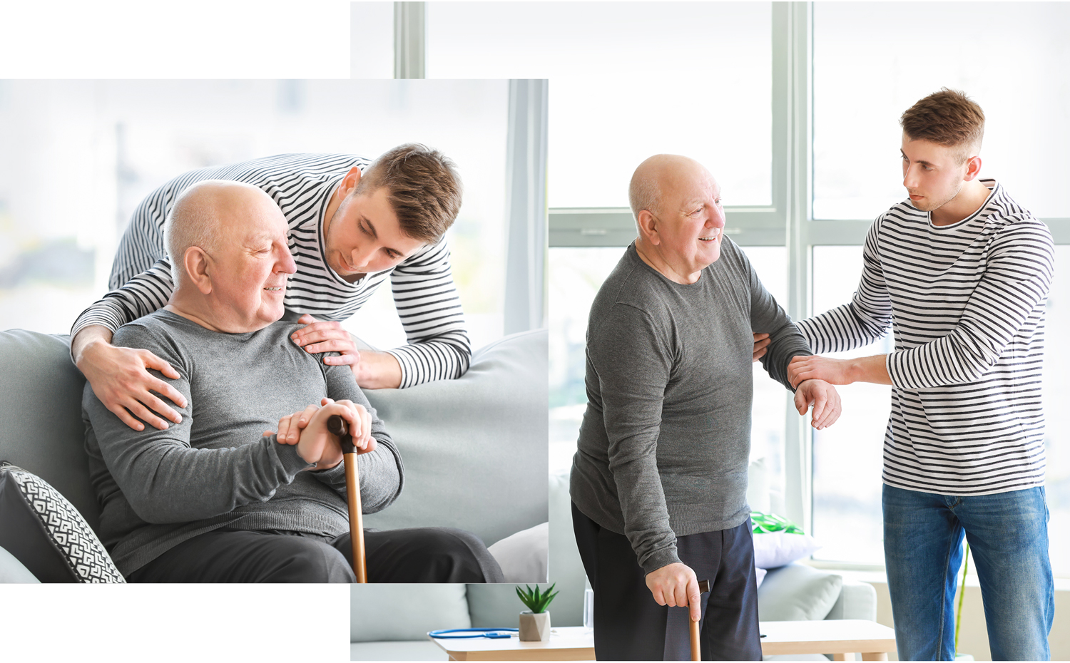
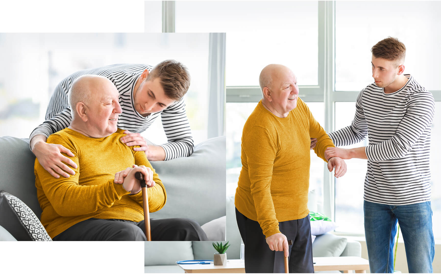

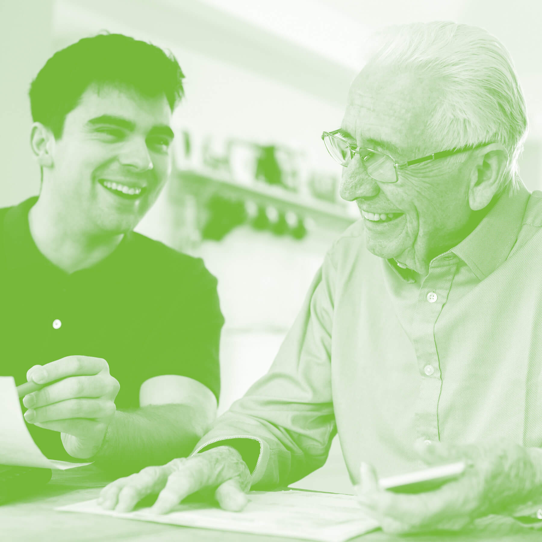
Within the Department of Migration and Integration and its website, the duplex method is used as a further stylistic device.
The colour scheme of the AWO Federal Association served as a basis. This was marginally adapted and supplement-ed by a further colour tone. Individual gradations of the respective main colour tone increase the colour spectrum and create more diversity in the appearance.
CRENEO
CRENEO
Detailed, composed illustrations with a light grain were created especially for the specialist service Migration and Integration. More colourful but still with a highlight colour tone, these illustrations also follow the global basic idea of colour orientation.
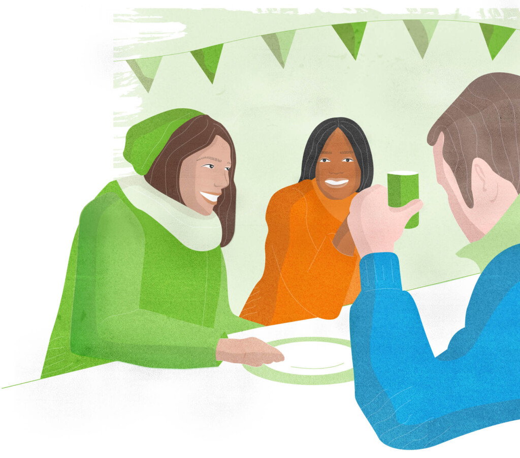
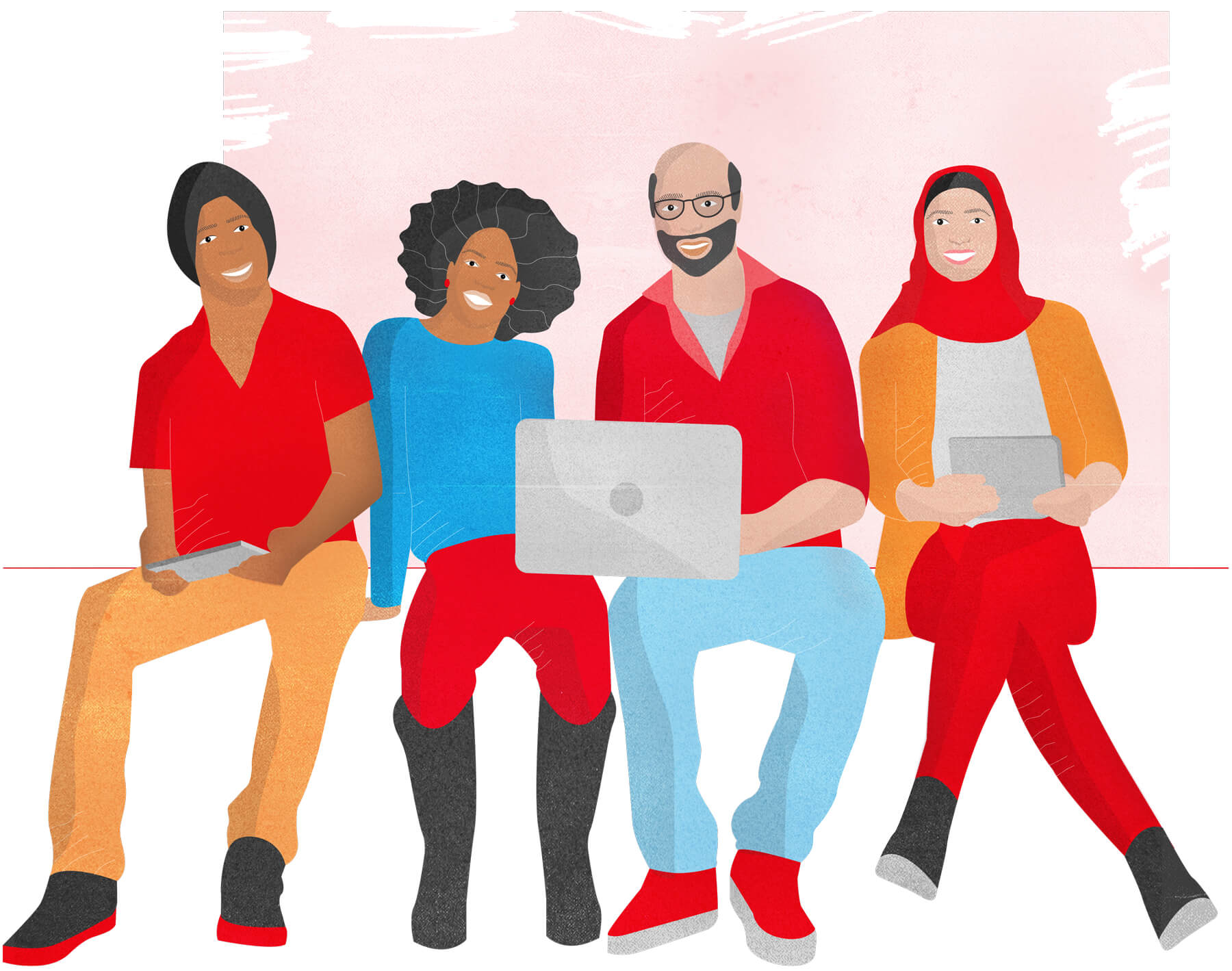
The illustrations flank all other newly defined basic design parameters and create a harmonious, friendly and accessi-ble appearance in its entirety.