The interface design of AWO Mittelrhein. Within the user interface, orderly structures, a high degree of clarity and stimulating communication impulses are the basis for the new visual digital presences of AWO Mittelrhein.
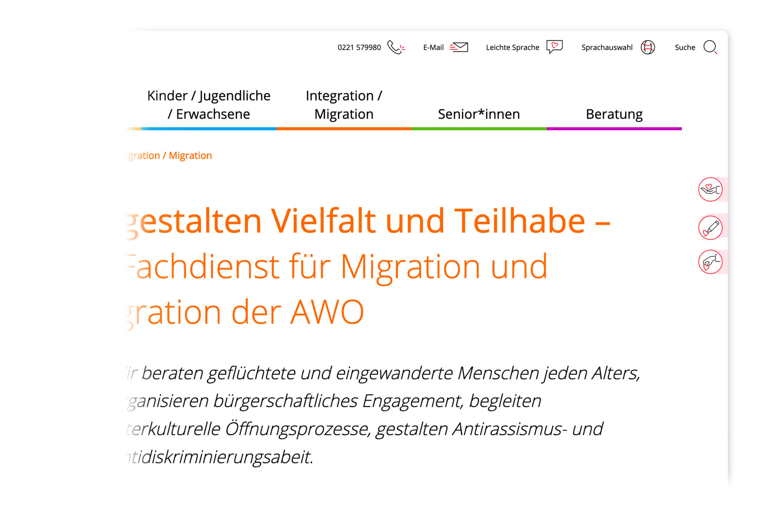
In the first visible area of the landing page, a slider functions as a quick entry point for the individual subject areas. 3 further info boxes can be individually provided with varying content. The mega menu is clearly structured and picks up on the colour coding that runs through the entire website.
Within the mega-menu, icons act as additional differentiators for the individual sections.
Language changes, easy language and contact options can be permanently activated.
An individual icon set was developed especially for AWO Mittelrhein.
The colour scheme was marginally adapted and supplemented by an additional colour. Detailed information on this can be found in the AWO corporate design case.
One of the main goals of the new image was to get people to join in. People who volunteer are indispensable for the AWO. They help people to help themselves, get involved in socio-political issues and stand up for the interests of socially disadvantaged people.

In order to attract new members, volunteers and donors to the AWO Mittelrhein, permanently visible call-to-action buttons were integrated.
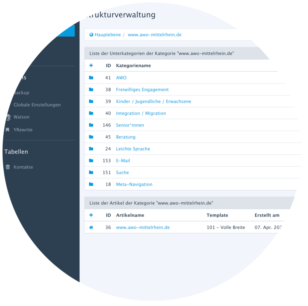
he CMS backend was designed and structured in such a way that even non-technical people can easily find their way around and perform basic tasks such as embedding news or events, adapting content, and even building new subpages completely independently. Within a digital training course, the range of functions was demonstrated and exemplary workflows were implemented together. The result is that AWO staff can manage the content of their websites completely independently. Of course, advice on special questions is also available at any time as part of the CRENEO Digital Service.

Direct interaction feedback, high contrast values or clear information structures promote the user experience in the long term.